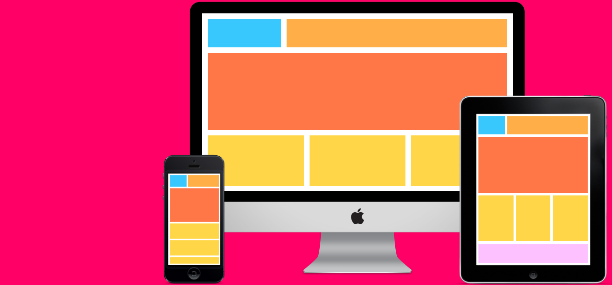
Last week, Google launched a new mobile-friendly search algorithm that sparked a bit of conversation around responsive web design (more on that here), mainly what it means. In explaining to our clients what responsive sites are, I would send them links to other articles I had found on the subject – a great reason to write my own piece on the topic.
So, what is responsive web design?
It is so hot right now! And it should be. A responsive site is a website that can be accessed by more people across more devices, more often and more easily.
Put succinctly in this article by yump.com.au, “Responsive web design is the approach to designing and developing a website so that it is optimised for a wide range of devices, from mobile phones to tablets to desktop computers.” Having a responsive website means users can read and navigate a website without horizonal scrolling or panning. It moves information around to responds to the screen it is viewed on.
Previously a responsive website was a nice-to-have option. Initially, clients would be put off by the additional cost to build their site responsively from the get go, and understandably so as it would add a zero or two to their web budget. But in hindsight, investment in responsive design is an investment in your digital future.
Based on browser statistics and projections from StatCounter, one in every five website users in Australia are now browsing on a mobile device. That is a huge percentage.
You can’t deny that mobile use is more prominent than ever and on the rise. Just catch a tram and see how many people are on their phones.
As more and more people switch to using mobiles and tablets as their main means of accessing the internet, it is predicted that in as little as five years, responsive web design will be incorporated by default into all web design and development.
The EJ site is responsive. We’ve built a few others too. Check them out on your phone or tablet here and here.
So what are you waiting for?

