We made it doubly difficult for ourselves. Every designer dreads becoming their own client. Add to that the subtle rigours of an evolution, rather than a revolution and you have a task fraught with the potential for rabbit holes and/or navel-gazing.
We set a clear remit; to be critically honest in our assessment of the previous brand. Identify and hero what worked, coalesce, coax, and eventually elevate what didn’t (yet). There were obvious gains to be made by bringing a focused and consistent eye to a brand and identity that had evolved over time. Some decisions were a little harder. How far do we push? How do we capture the nuance and span of our consultancy?
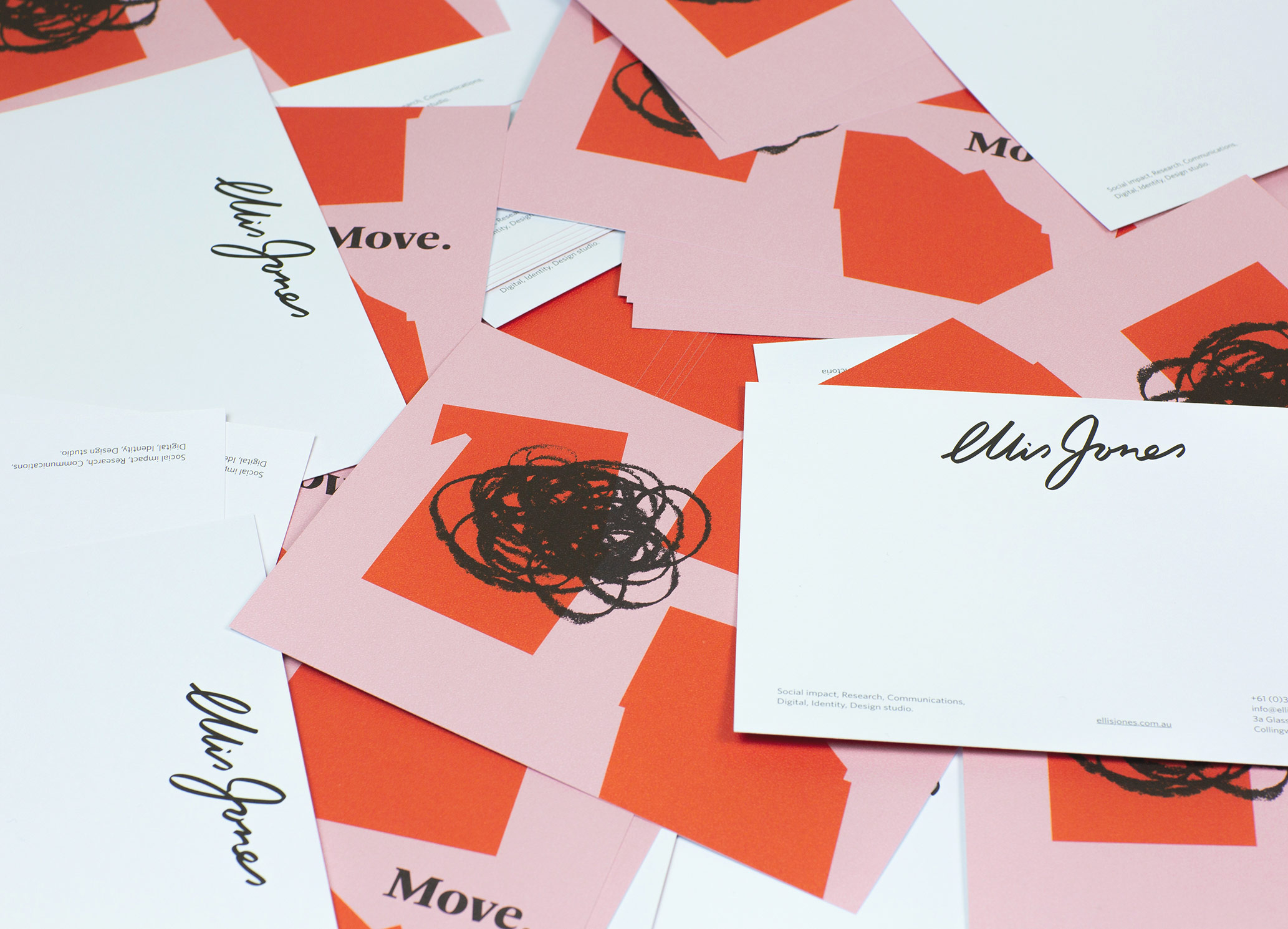
Logotype
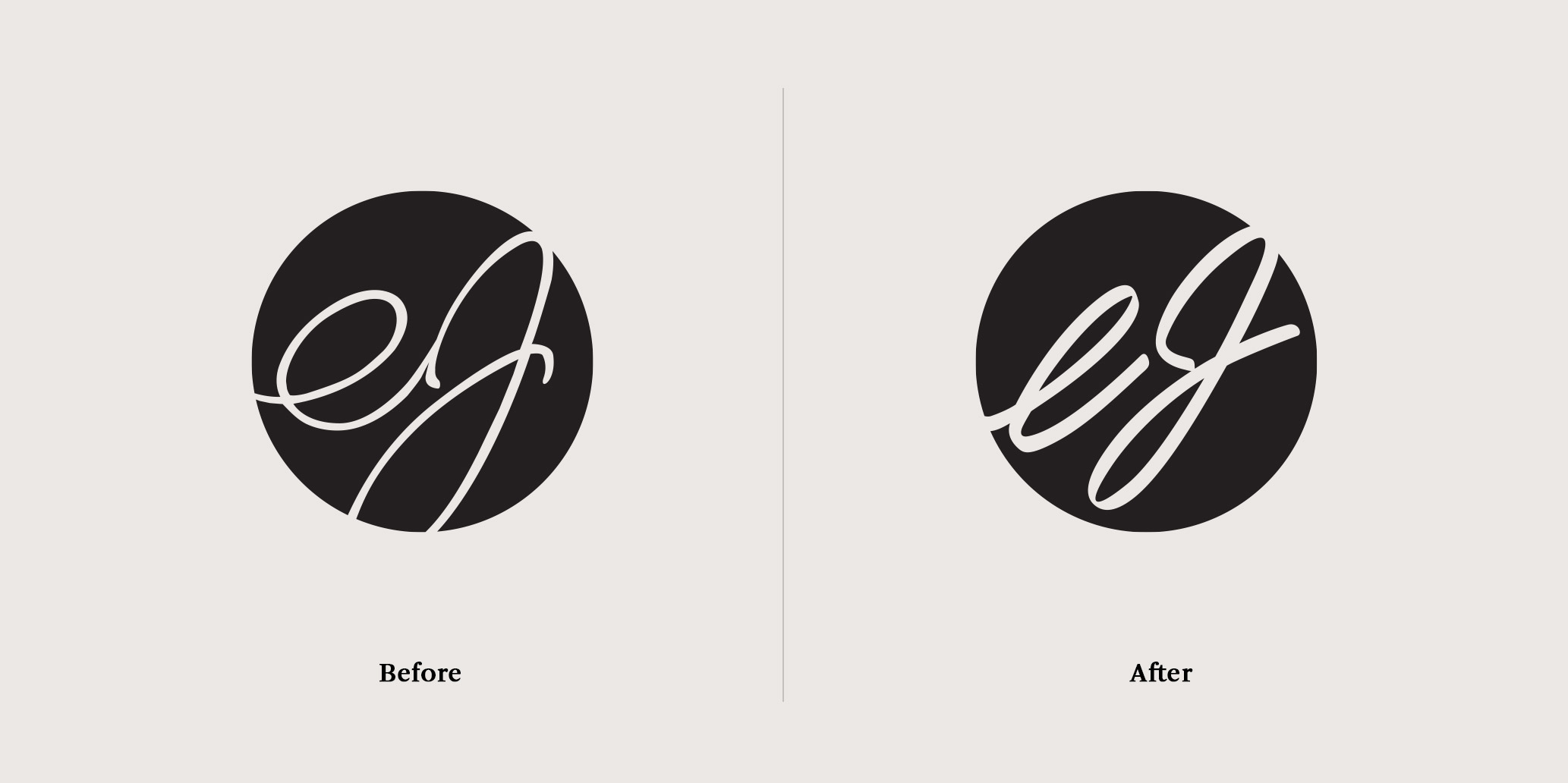
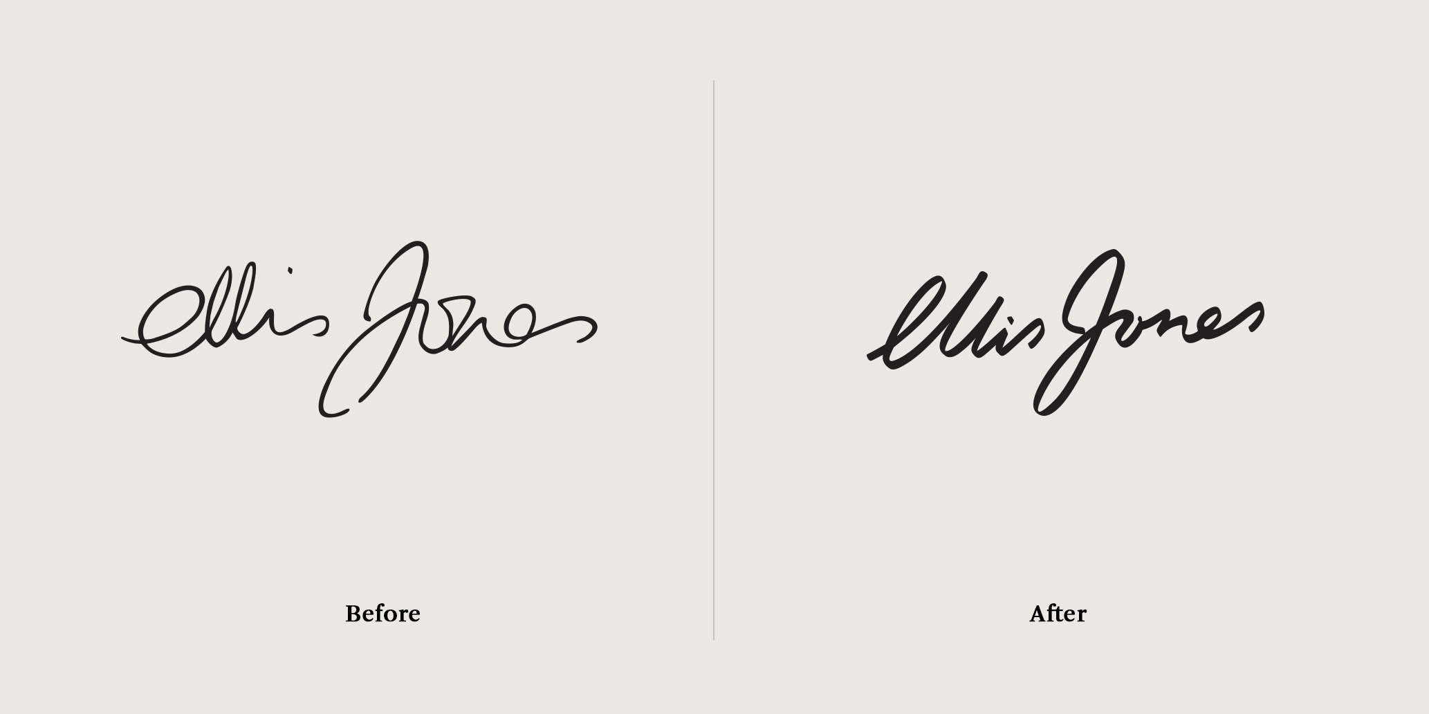
The ej script was at the heart of the old identity. It was driven, in its first incarnation by Rhod’s own handwriting. We worked through hundreds of variations of hand-rendered script to get to a point that took its lead from the idiosyncrasies of our founder’s hand, but also expressed a typographic rhythm more in keeping with the aesthetic aspirations of our creative output.
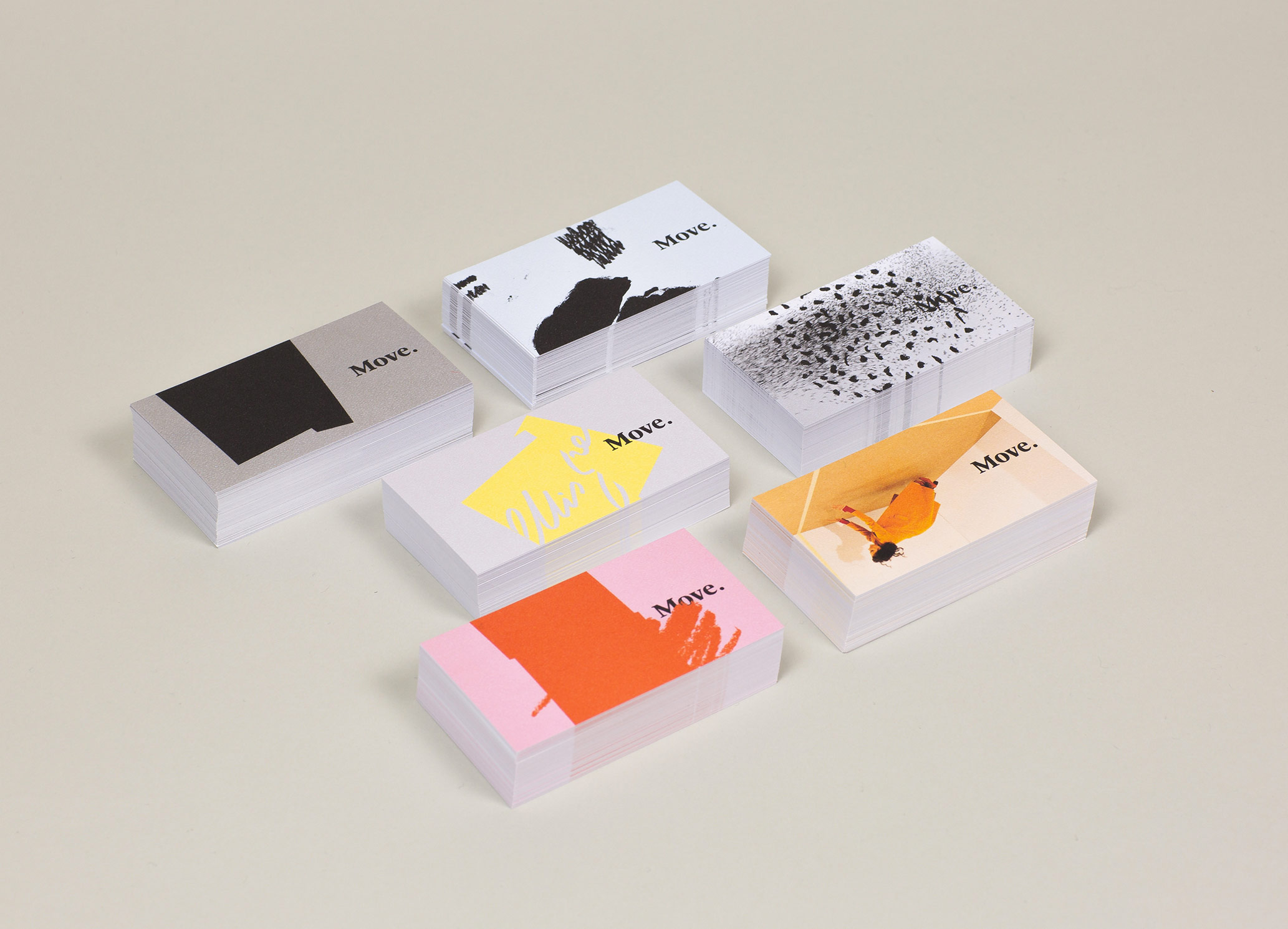
Colour
Similarly with colour, we took the existing palette, grown organically over time, and reflecting the path of the business to date, we cleaned it and focused it. Selected robust, reproducible colours across all processes. We also added an accent colour in warm red for vibrance and contrast.
Image making
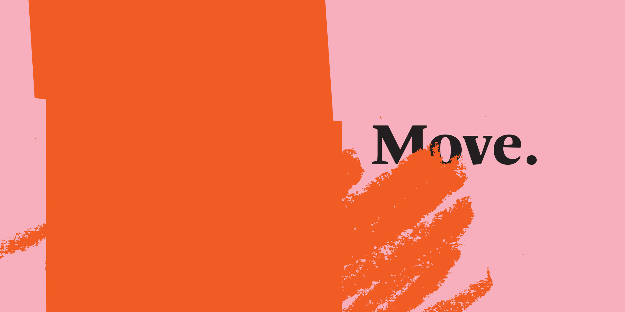
Photography, texture and mark making were all put in the mix. Any stimulus to impart a sense of movement, impact and intrigue. Our approach comes down to a consistent principle and overarching concept, expressed through a variety of media. The visual library will grow in breadth and richness over time.
Typography
Our previous visual identity hinges on two core type families, Arnhem and Whitney. A transitional serif and a humanist sans, offering a full gamut of expression from conservative to contemporary, from printed documentation to digital experiences. Rather than update, we simply documented, creating a master brand style sheet from 7pt captions to super display for projection and architectural application.