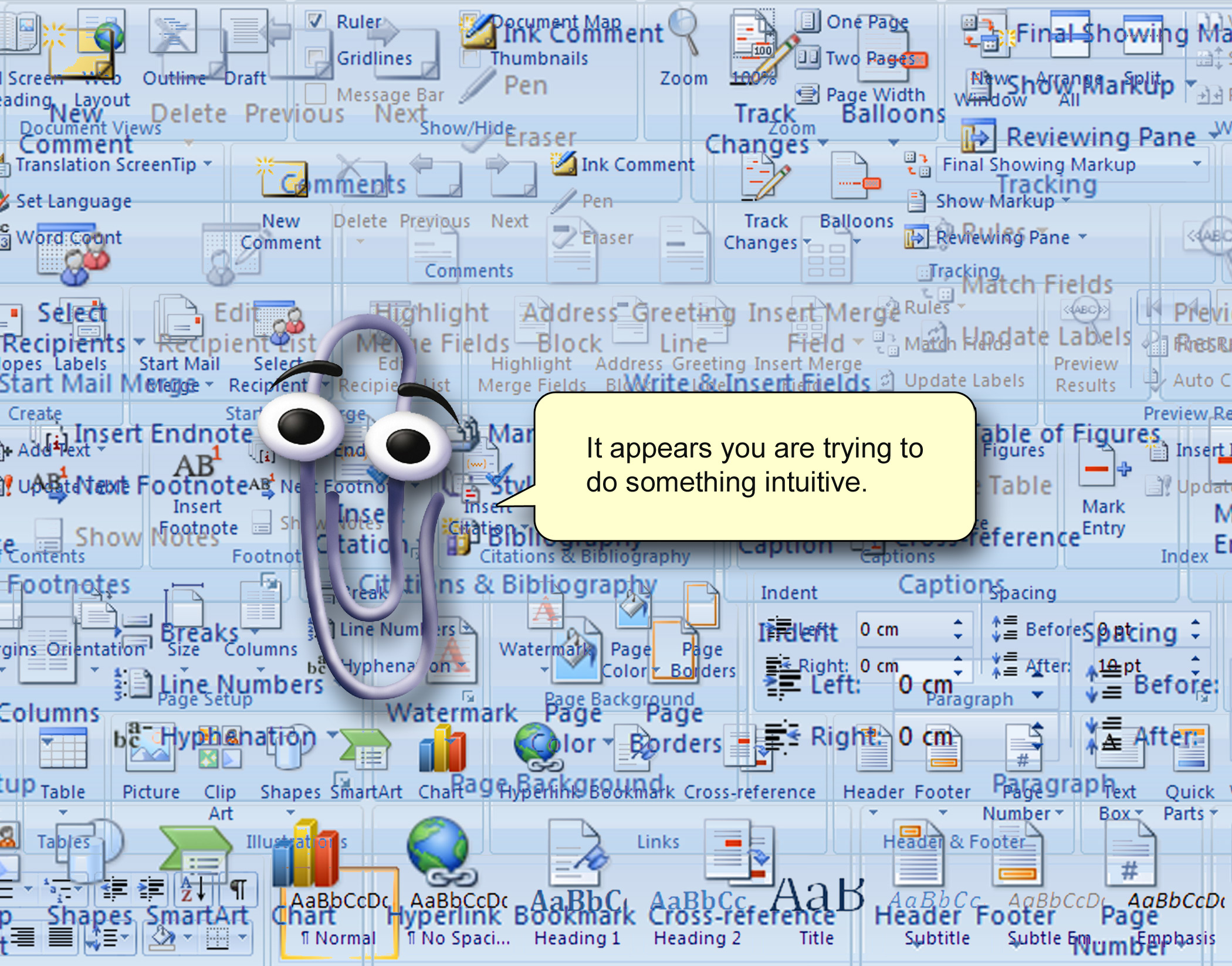
As a graphic designer, I have to say I hate using Microsoft Word.
The graphic editing tools are horribly clunky, the user interface unintuitive. Working out how to achieve something specific can sometimes be a mystery only solved by sleuthing or some sort of magical insider knowledge.
Having said all that, there is a beauty to the generic nature of a Word doc. In a world where we are constantly being sold to via visual manipulation, it is important to have a standard document format that does nothing other than communicate information. There are no fancy graphic devices vying for your attention, no marketing taglines, fancy gradients or sexy icons trying to divert your attention.
This lack of visual stimulus ensures people focus on what matters, the text. Language is the hero of a Word document.
Using a Word document is an efficient means of both creating or distilling information. When crafting a piece of writing within a Word doc, the writer does not need to think about how it is going to be presented in order to maximise impact. The impact is in the words themselves.
Conversely, when a person is reading a Word document, they are not trying to decipher any visual language or graphical nuance, it is the written word they are absorbing and nothing else. In business, branded Word doc templates are a must-have to ensure your corporate communications are all singing the same tune visually whilst conveying your message.
Sure, some Word documents can be uglier than others, but they are ALL ugly to some extent. Word documents create an even playing-field, where no one side has an advantage over another. Everyone understands the constraints and are therefore more willing to allow their brain to do what matters, create or absorb information.

