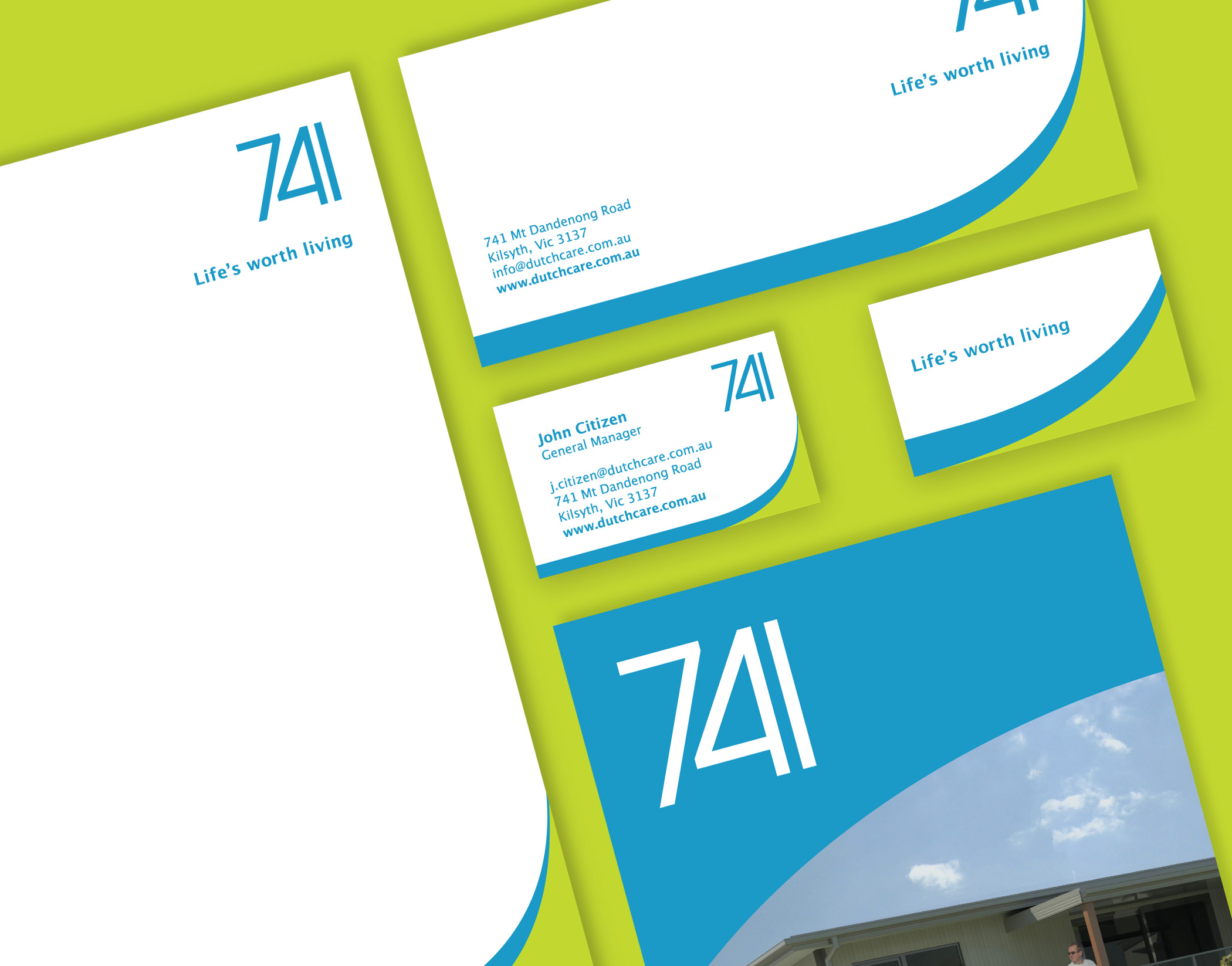
Good design is not always defined by how ‘amazing’ a piece of visual communication looks. Arguably more important is how relevant it is to its intended target audience. Every designer wants to make something look as good as they can, but sometimes this is counter to the goals of the client.
This was our thinking when Ellis Jones undertook the visual identity design of a new retirement village for DutchCare called 741.
Older people generally have a different idea of aesthetics than younger people, simply because they have been exposed to, and become familiar with certain visual styles and not others. There is no point in creating a young, contemporary visual identity for an older audience. Not only will they feel alienated by it, they will not be able to decipher the visual language as effectively as something they can relate too, negating any attempts to cater to their needs and wants.
DutchCare has an established identity they wished to carry across to the new 741 development, so it was important that there was a strong visual relationship between the two. DutchCare is a trusted brand within the aged care sector, and emulating their identity for the new development meant any associations with the DutchCare brand are transferred to 741. This means all of the values and associations customers have come to expect from DutchCare such as friendliness, safety and compassion are automatically reflected in the 741 retirement village, meaning less work is required to create brand awareness and trust.

