Annual reports. Rarely the darling of the communications calendar. Often spoken of with ‘colourful’ adjectives, and no small amount of contempt. It doesn’t have to be this way. Annual reports can be brand champions, rich in personality and narrative, and brimming with your organisation’s impact.
Rhod, David and the EJ Design Studio have logged their fair share of hours on annual reports over the years, from community organisations, to industry peak bodies, state and federal government departments and agencies. So often organisations miss this rare opportunity to engage a multi-stakeholder audience with a story beyond mere compliance. You can bring to life the practical impact made on the lives of your customers, clients, collaborators, and partners by design.
The following article contains the fruits of our collective experience, along with a sweep of current trends in report design. Regardless of scale and budget, there are ways to make your report stand head and shoulders above the pack, to engage, inspire and be memorable.
Wow data
When it comes to data, big is beautiful. Design should draw in the reader, and facilitate their access and understanding of data. There is beauty in visualising big data sets with nuance and respect for their integrity; intricacy can attract and validate the written narrative. Metaphor or visual puns can inject humour and encourage accessibility of complex numbers. Colour and form can accomodate higher context messages whilst also introducing a hierarchy to data reporting. There is no excuse for banal bar graphs any longer!

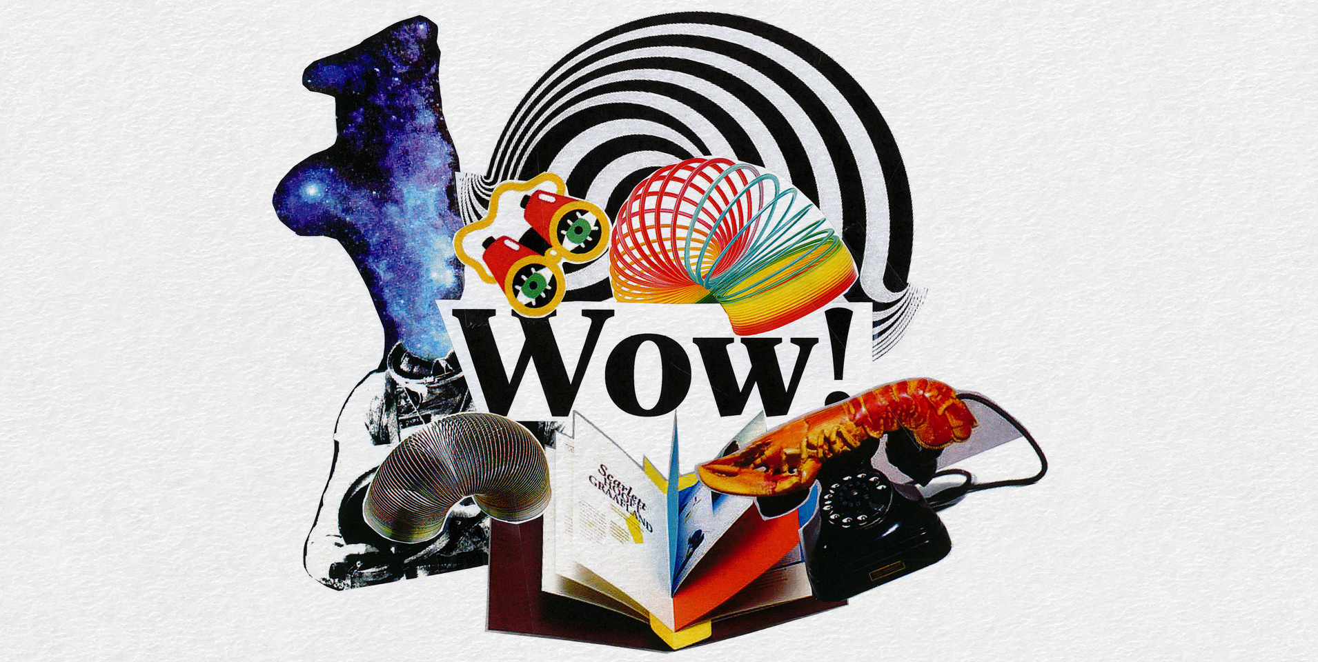
Colour riot
Colour and emotion are old bedfellows. Colour will impact on a reader subconsciously before any conscious processing of content occurs. Use it wisely, use it wildly! Colour
can be subjective, but for practical purposes. It can also be objective. Some colours carry global symbolic associations, some local, some personal. The weaving of these threads is where the magic occurs.

Telling tales
Reporting is an opportunity to embed your purpose and brand story. It needn’t be a technocracy, populated by sterile objectives, outcomes and ROI data. Tell your reader a story, enhanced by visuals and materials. Illustration, photography, and formats that entice and engage set a document apart.

Stretching reality
Opportunity is no longer tied to the number of printed pages. Digital reports are increasingly common, used in concert with a printed ‘executive summary’ version as a jumping off point to the detail of data and analysis. At the intersection of the physical and digital is augmented reality (AR); think: holograms, animation, mapping of digital assets onto the ‘real world’.

Zero trees
A digital annual report broadens the horizons no end. Interactivity, video, animation, and real time visualisation allow users to construct an experience in tailored and non-linear ways. Key information can be delivered at different levels of depth and complexity dependent on audience need, and content can be literally and directly connected to external sources, entities and models. In situations where a physical report is still a statutory reporting requirement, a digital companion may allow the print version to be lighter in content, resources and footprint.

The time is now
It pays to put design in the mix early. Considerations around format, production, photography, illustrations and other commissioned content can help shape project design, often creating efficiencies in execution and budget. Let’s make sure this report is one that is talked about for years to come.
There is no better time. If you are currently laying foundations for this year’s annual report, let’s talk.
See how we practice what we preach. ARENA invited Ellis Jones to undertake the design and development of their Annual Report 2016-17. Read all about it here.