“Design is a plan for arranging elements in such a way as best to accomplish a particular purpose.” – Charles Eames, legendary architect, filmmaker, graphic and industrial designer.
A brand can be visually expressed in many different ways. The most common and arguably the most revered is the logo.
Of late, logotyping has broken out of the strict rules of conformity that once shackled the discipline. The static logotypes we’re used to are making way for a new era of dynamic logotypes. In layman’s terms, this means the image can be changed – even animated – but still maintain the visual identity characterising the company or brand. The variations can be in colour palette or structure but never both.
Given that the definition of a logotype is ‘a graphic element which uniquely identifies corporations, products, services, institutions or events in order to publicly differentiate the owner of the logotype from other entities’ it’s interesting no one thought of it earlier! Keywords here are ‘uniquely identifies’ and ‘publicly differentiate’.
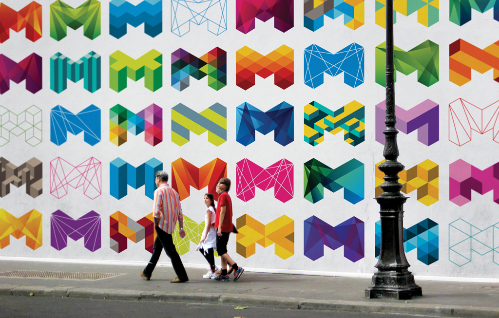
A pioneering example of dynamic logotyping is the work done for the MIT Media Lab.
E Roon Kang and Richard The were called upon to come up with a fresh visual identity for the media arts, design, technology and research laboratory. What they created was an algorithmic logo capable of up to 40,000 permutations in twelve different colour combos. Here’s a YouTube video that neatly sums up the versatility of the work.
Telstra’s recently had a crack as well. They have used the same logo with different colour applications to represent different elements of their company. Colours used in the logos are applied to different products and services creating stronger visual identity and customer associations.
Ellis Jones recently worked on a branding and visual identity project for new national aged care body, Leading Age Services Australia (LASA). LASA was formed from the branches of former aged care group, ACAA, with representation across Australia in each of state. Each branch has its own unique characteristics and operations and, bringing them forward with the new group was a priority.
Our designers proposed development of a visual identity and branding guidelines to not only differentiate the organisation from other peak industry bodies and resonate with target audience segments, but also differentiate between the different state branches and enable them to foster a unique identity while still clearly being part of the united LASA group. The exercise not only produced a great result, it saw each branch engage staff in the process thereby building excitement around the new entity.
Branch staff selected colours synonymous with their state – sourced from flags, footy teams and natural landscapes. These were then applied to the original logo, to striking effect. Although the colours vary, the structural integrity of the logo never changes, ensuring it is immediately recognisable.

Combining design and coding know-how, our designers can dynamically logotype anything. Call us.