With numerous projects still in progress, I thought I’d digress from showing work we’ve completed here at Ellis Jones and share thoughts on one of my favourite designers: Fuel.
Back of the library, Queensland College of Art, 1995, running through pages of any and all design magazines I could get my hands on. I remember coming across work by a bunch of London design students collaborating under the moniker ‘Fuel’ (fuel for the fire, a kind of hunger, they said) and producing these strange, unaesthetic posters; bludgeoning together photocopied images, bad type and crude slang.
It was punk anti-design and, being a young kid in quiet ultra-suburban Brisbane, I found it difficult to understand this angry British sensibility but couldn’t stop looking at their work.
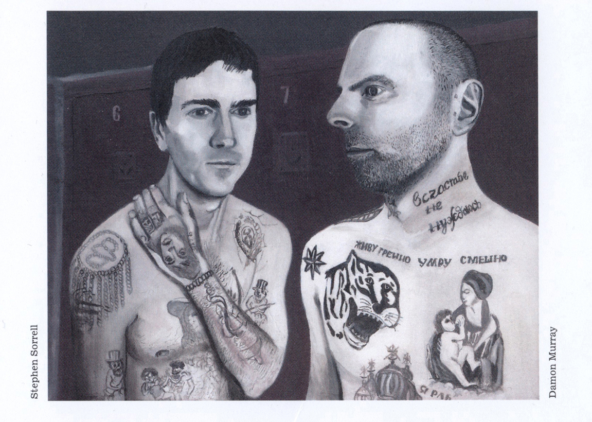
Almost 20 years later and their body of work has grown into a mature, intelligent set of works for publishers, artists, film directors, and and their own book publishing business. They still haven’t compromised and they’re still one of my favourite graphic design studios. Their recent book covers are direct, stark and sophisticated yet appear so crude and simple at first glance. They never look very ‘nice’ but that’s just the point: they cut and stab away in the viewer’s mind long after being seen.
I once visited them in their London studio. Without an appointment, they refused to see me so I slipped my folio under their door and said I’d be back in a week. When I came back to pick up the folio, they let me in. The studio was spartan, not a computer in sight, and the two of them (two others had left by then) were sitting at a large table in the middle of the space, with their shoes on the desk, reading the newspaper. It looked like they were doing nothing, and they weren’t that interested in my Australian enthusiasm.
I was so impressed!


