In June last year Google released its Material Design spec which has swiftly become a new visual language for user interface (UI) design, particularly for Android devices.
Based on the fundamental principles of paper and ink, Material Design explores visual surfaces including elements within colour, shape and space. It’s purpose is to provide users with a system that “synthesizes the classic principles of good design with the innovation and possibility of technology and science”. As such, Material Design is more than just a style guide, it is a valuable launching pad for digital designers to adapt and build on principles suitable to their own projects and creative processes.
With Google having released a Material Design spec update in July, it’s time to understand the basic concepts behind this new digital language.

Tactile surface.
What it is:
Material Design interfaces are made up of tangible layers or what is considered to be ‘digital or quantum paper’. To assist users in better understanding the anatomy of the interface and the relationships within it, Material Design presents its users with layers that are stacked and arranged at variable levels to cast a shadow on one another.
How to use it:
Tactile surfaces can be used to create a shadow or texture on a layer to assist in identifying one object from another. A simple shadow or texture can also make a layer appear more realistic.

Print design.
What it is:
Material Design has employed a traditional print design approach to assist in distinguishing the two main forms of content within an interface. Material Design refers to every surface or layer within an interface as ‘digital paper or quantum paper’ and everything that is found on a surface or layer such as typography, icons or images is called ‘digital ink’.
How to use it:
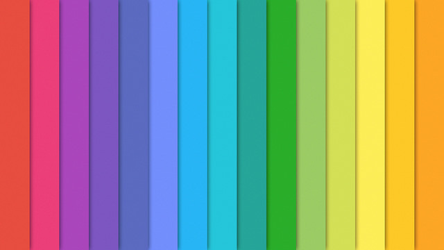
The print design concept acts as a framework to assist in breaking down the elements used within your ‘digital paper’ or ‘digital ink’ such as colour or typography. Material Design’s colour palette can be used to alter colours within images. Material design’s typography system also assists in determining how you are using your font on your digital paper and to group font types including sizes and colours.

Meaningful animation.
What it is:
Things don’t just appear out of nowhere and disappear into the distance in everyday life. This is why Material Design highlights the importance of using digital animation in a way that is purposeful and makes sense to a viewer.
How to use it:
Meaningful animation can be used to reinforce a user’s action or guide a user’s attention. Material Design reiterates the significances of purposeful animation. Consider how you can create authentic animation when designing your interface.

Adaptive design.
What it is:
Google’s concept of adaptive design is about how you apply all of the above ideas to different interfaces. It is about organising information and its placement on devices that have varying screen sizes and resolutions.
How to use it:
Google whiteframes can help you understand what space you have to work with across a range of platforms. The common principal that can be applied when using adaptive design is: smaller space = less information. Content blocks can help you reduce the quantity of content for different devices.

Watch Google’s Material Design video to find out more.
Talk to us about digital design.