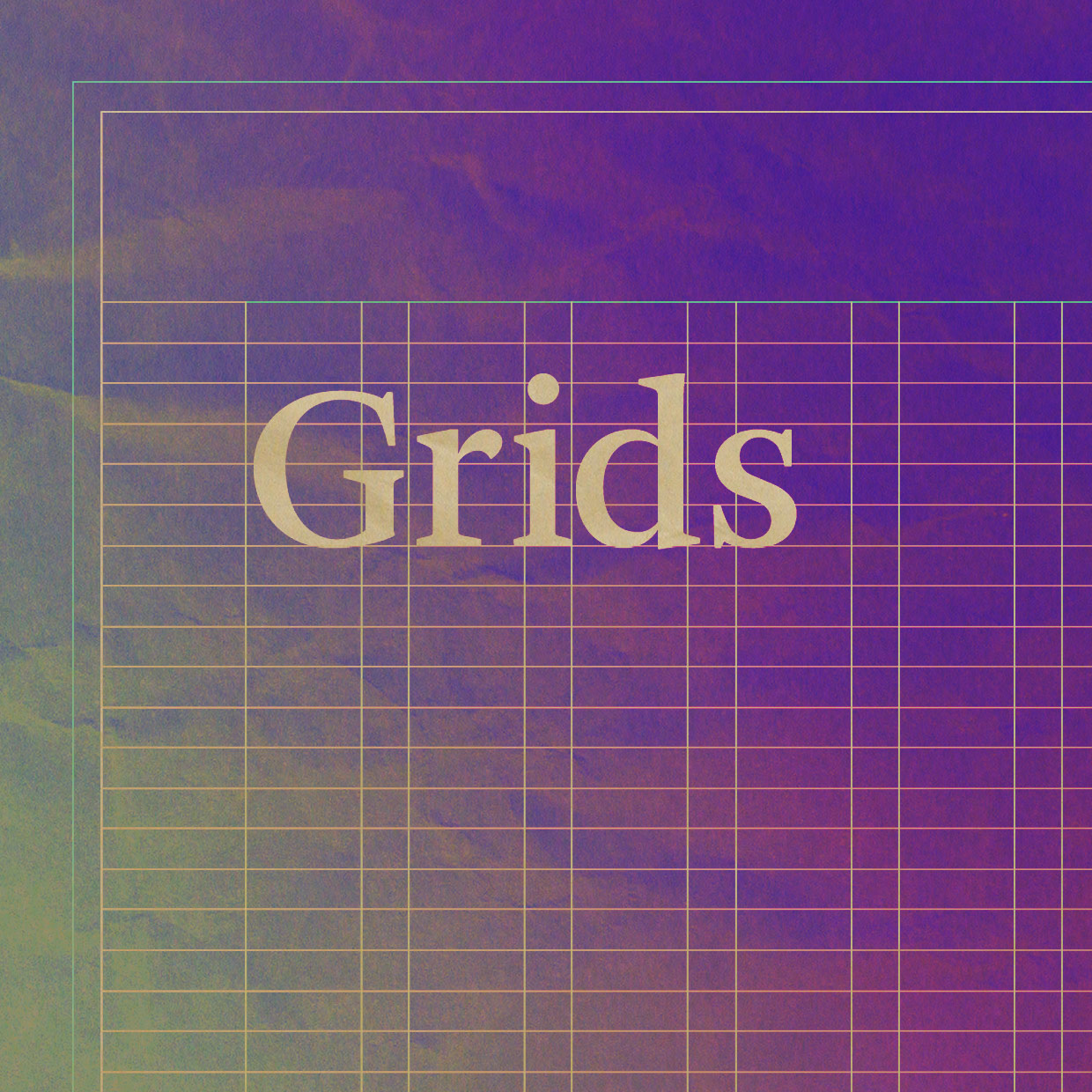
Though layout grids are almost never explicitly displayed, they are essential when developing visual communication materials. Grids provide a structured approach to concise, clear communication, and if effective, reinforce the values represented by a brand and associated branding elements. There are many different approaches to creating grids, from using the ratio of a page’s dimensions as a basis, to mathematical grids such as the ‘golden section’ which is based on Phi. Grids are by no means a guarantee that a design will be automatically beautiful, but by using a grid as a basis there is a greater chance that your designs will not only be more consistent, they will be more effective and legible.
An added bonus to developing grid based layouts is efficiency. Once a base grid style has been developed, it can be carried across multiple communication mediums, ensuring all materials are created with consistency and minimal fuss. This not only maintains visual integrity, it means you spend less time pushing pixels. A well designed grid allows a designer to focus on experimenting with where specific elements and content should be placed, as most of the questions about the page layout have already been resolved. This reduces time spent trying to resolve issues such as ‘how wide should the gutter be’, ‘how many columns of text can there be?’ etc.
Grids may be a little time consuming in the very beginning, however once a good grid system has been developed, you save a lot of time in the long term, and ensures you are communicating succinctly and efficiently.