Leading Aged Services Australia (LASA) recently came to us with a request to redesign their Aged Care news magazine, Fusion. They had a template done that wasn’t fitting the bill, and with our previous collaboration on brand identity, it was clear we’d have a strong understanding of the audience and purpose.
My first stop was to run though the old image archives and assemble pictures that showcased older people in positive moods and environments. I discarded any reference to what had been done, went back to basics and began with the styles laid down in their basic brand style guide.
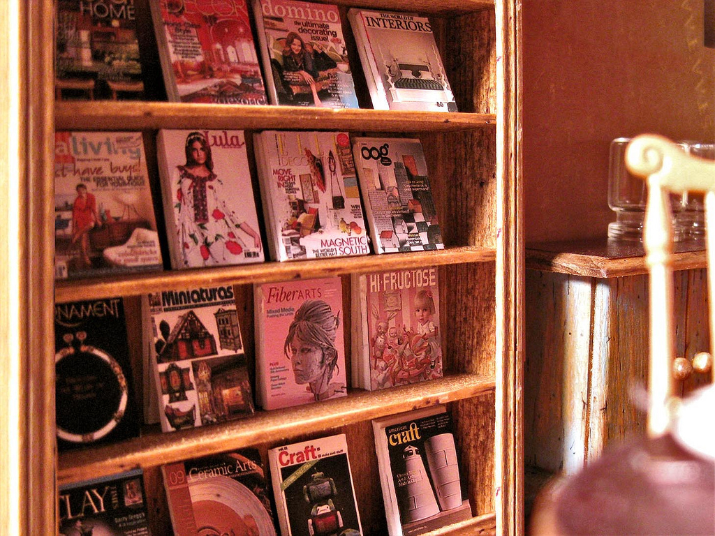
I laid out a range of magazines on the cutting table, assessing the different opportunities for placing cover text as ‘calls to action’ for inside stories.
The initial drafts layouts show clean colour and type integration with images at the forefront.
Why images at the fore? It could be my bias, but with a passing glance, we humans will always be drawn to a face. For those in the industry, these positive images are what they’re striving for.
With each passing draft, I tried and failed using small logo elements for title and feature article highlights. But that’s what drafts are for — give it a go, just don’t settle for ‘OK’. That’s where failure becomes progress.
We passed through a few drafts with the CEO, Gerard Mansour, who continually gave us good feedback and took interest in the details. Communication design is only as good as how well the designer understands the isse to be communicated. Often that knowledge resides with the client and it can take more than just a conversation before deeper understanding can be conveyed.
Gerard’s involvement was key to us moving from a fair initial draft to an excellent, well-executed communication piece as seen above. I then applied this design style to the magazine template, which is being used by another agency to produce the magazine.