Something deep within us seeks meaning in all things. This yearning for narrative is at the foundation of both science and religion – mutual territory.
The power of a logo design begins with the aesthetic but to stop there is to deny its true power. After all, what will you say when a peer asks, ‘so why that logo?’
Great logotypes not only convey meaning and context for a brand, they tell a story. Developing a narrative within a logotype allows its patrons to share it, creating a sense of ownership and pride. It also allows employees and end users to have a greater understanding of what the logotype and brand stands for; its values, goals and aspirations.
Ellis Jones was tasked to create a new logotype and visual identity for Victorian aged care group, Doutta Galla Aged Services.
Doutta Galla is reportedly named after the wife of Jika Jika, a local Wurundjeri chief. John Batman signed a treaty with several local chiefs including Jika Jika, exchanging land for regular payments of food and goods. Though there is some contention over the legitimacy of the treaty due to the fact that none of the indigenous chiefs spoke English, it is regarded positively by many who contend that John Batman was one of the only early settlers to recognise the local indigenous population as true owners of the land. (The treaty was later overturned by Governor Bourke, as British law stated the land was owned by ‘the Crown’).
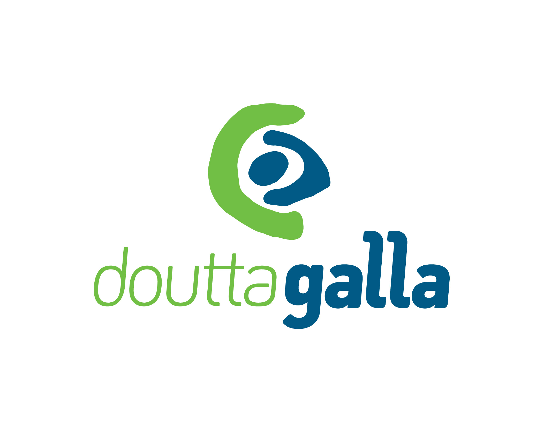
During the research phase, we also uncovered a document containing several indigenous Australian pictograms and their meanings. One pictogram in particular stood out as being relevant to our goal of creating an association between the aged care facility and indigenous heritage.
The arched symbol represents ‘person’ in the local indigenous visual vocabulary and was the catalyst for our concept. Aged care facilities are made up of various groups of people, all working together for a common cause, that being the wellbeing of residents.
By incorporating the symbol for person within the logotype, we were able to convey the relationship between these groups and the residents. The resident, the most important aspect of an aged care facility and the core business practice, is represented by the circle in the middle of the logo. Surrounding the central core is the symbol for person, representing the care workers and staff of the facility that create a protective environment around the resident.
Encircling this is another symbol for person, alluding to groups outside the aged care facility that provide support indirectly. This could include the residents family, social groups, care organisations, and the community generally.
Together, these symbols represent the various layers of care given at Doutta Galla, with the most important person, the resident, at the centre. They communicate the dedication of Doutta Galla to providing the best possible care for an individual, via engagement with the community outside the facility. Combined, these elements create a symbol that is gentle, approachable and unique to Doutta Galla, while reflecting brand values and business practices.
Ellis Jones facilitated the development of a well articulated brand identity – the articulation of what makes the company unique and the consumer experience compelling – for Doutta Galla in 2007 and again in 2013. We enjoyed an incredibly fulfilling journey of shared discovery and this is all embodied in the final visual interpretation of the brand.
This is a nothing short of utopia for us. Strategy meets design!
And every Doutta Galla employee – and every stakeholder advocating the company’s cause – need never be stumped at the BBQ with that old question ‘so what does it mean’? Instead they will bask in the golden appreciation of a primal need for meaning, evidently satisfied.
A logotype grounded in narrative is a gift that become legacy as soon as it is launched.
Talk to us about well crafted symbolism.