Someone once described typography as “The clothes that words wear”. When you think about the world of logos and visual identity, this makes a lot of sense. These clothes can happen arbitrarily (think Coca-cola), or by design (think Mercedes-Benz). Obviously, we prefer the latter. Words carry inherent associations and references; visuals (in this case fonts and typefaces) do as well.
If Apple and Samsung were people, how would they dress? Would one wear a black roll-neck and sports coat, while the other wore a sharply tailored suit? Or perhaps torn jeans and a leather jacket? Would you place them in the same world, or worlds apart?
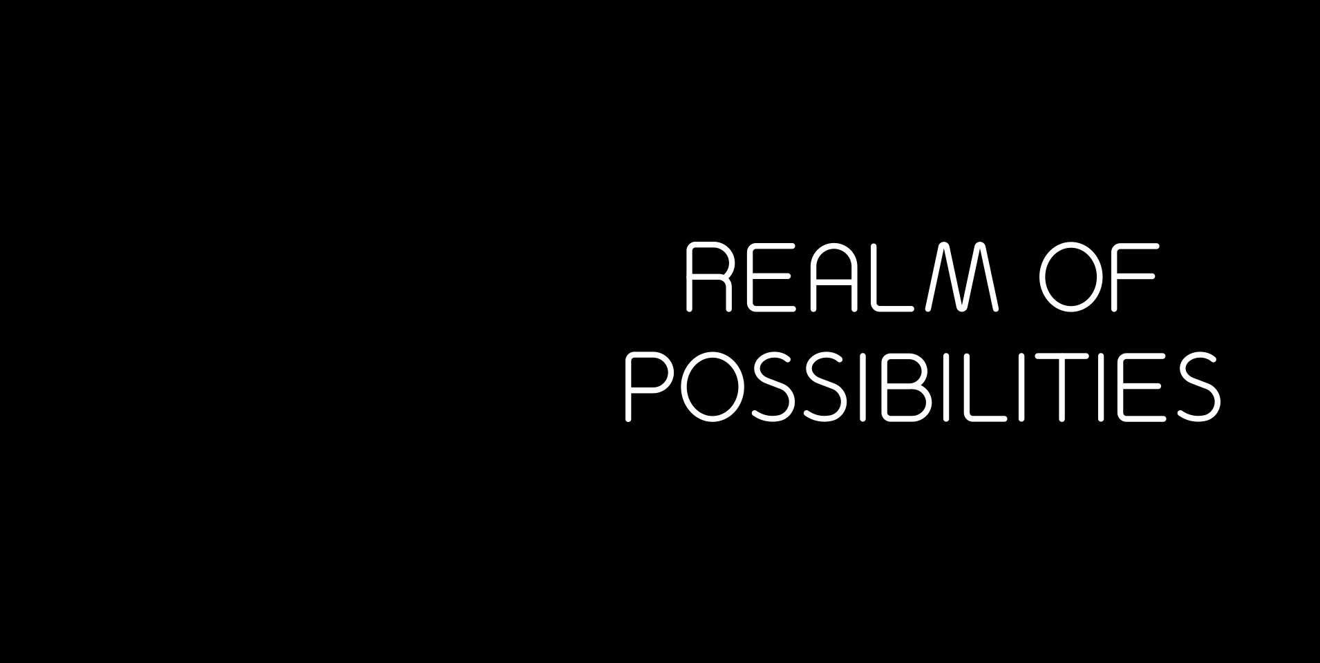
The EJ Design Studio recently turned our gaze briefly inward, as we developed the visual identity for our workshop and event space, the Realm of Possibilities. The name evokes a certain mystery, and the language developed by the EJ team extrapolates this into a world where anything becomes possible. A provocative question “What might you do when you enter the Realm?”, allows visitors to map their own path. From a visual identity standpoint, we decided to explore the ‘dark side’ of these associations. What possibilities lie in the dark, waiting to be uncovered?
Neon signs are part of the urban fabric around the Realm. Promises of experiences, wholesome or vice-laden, petition your attention at every turn. These are places where things happen.
And so the centerpiece of the Realm’s visual identity is a bespoke font inspired by the visual language of neon. It draws direct inspiration from the physical restrictions of hand-bent glass tubes, using geometric, sweeping rounded corners, and maintains a consistent weight of line through all the letterforms. The scale and proportion are carefully considered to fit comfortably within the broader visual language of Ellis Jones.
Do we expect you to see the logo and think, “Brilliant! 2am Kebab by way of knocking shop”? Of course not. But we believe that somewhere in the provenance, we’ve captured cues of urban nightlife, and all that it holds, and added it to the character of the Realm. This is the difference between influence and pastiche.
Typography is just one of the many variables that we consider in visual identity development. Colour, photography, illustration, materials and formats, all carry associations and relationships for an audience. Each element can be strategically and holistically considered to achieve maximum impact, and help your clients and prospective clients better understand who you are and what you do.
Interested? Let’s talk about the dress sense of your brand.


