Designed information helps us understand the world from a different perspective. Infographics (the act of visualising data) are interesting data correlations that tell a cultural, economic or social story.
Currently information is generated at an extraordinary rate, we have access to countless amounts of it by interacting frequently online. As prosumers we find ourselves asking more questions about the products we use, services, world and social issues. Infographics offer a new narrative; we are able to see the complex information in a simplified and often visually appealing way.
People are tired of one-dimensional histograms, pie charts and maps – too many PowerPoint presentations. But providing interesting visual interpretations of data makes it attractive and memorable. Data visualisation becomes a way to discover new stories, and present them to people in a way that makes sense.
The infographic becomes a broader communication tool, used by politicians, the media (and the media office!), and other stakeholder organisations. Strategic placement of the graphic in online industry/themed forums takes it to a global audience. We’ve all seen the same interesting diagrams and maps re-used again and again because they tell the story better – now they’ve become extremely portable through online social networks.
This Diagram created by Sébastien Pierre helps define what data visualisation is.

These are the components that make up the diagram:
- Fields: Design, Communication, Information and their mix: Visual Communication, Data journalism, User Interface
- Raw elements: Look & Feel, Idea, Data
- Disciplines: Journalism, Information Architecture, Typography
- Process elements: Visual Design, Objective, Dataset
- Outputs: Layout, Story, Report, Data Analysis, Dashboard, Interface
- Final result: Form, Concept, Knowledge
- Core competencies: Readability, Logic, Usability
- Core values: Simplicity, Informativeness, Relevance
Below we share some infographics we found interesting. This is still a very new tool that is starting to take off, so they mostly showcase world issues on topics outside Australia, however we can all relate to similar issues to see the relevance of doing one for our own social, economic or cultural understandings.
Many of these can be used as an interactive piece, motion graphics videos or as print design. Once the information is collected the are many mediums to launch with.
What we’re always keen to remind our clients is that the focus should be on understanding: presenting information in a way that improves the reader’s comprehension. There are some very beautiful infographics out there that leave you scratching your head!
Growing the green job boom.

(click for larger view)
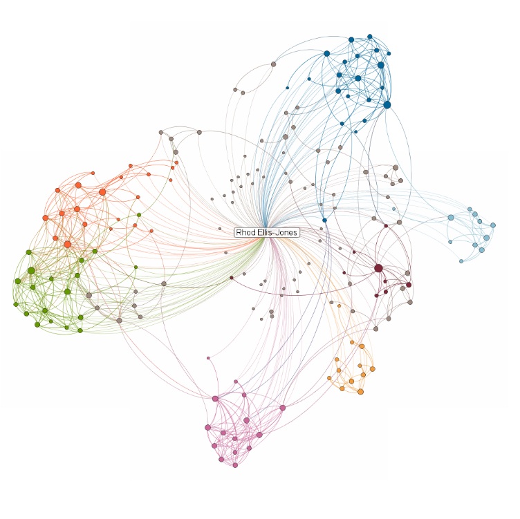
Visualising your LinkedIn Network.

(click for larger view)
The new LinkedIn Maps is a very cool interactive infographic that visualizes your own LinkedIn network. How does your network look?
What Does an Australian Summer Look Like on YouTube?

(click to see infographic in action)
“A new YouTube experiment that tries to provide a more meaningful interface to recently submitted Australian videos. It’s still happening so by the end it should have a compelling archive of the events, experiences and people from all around Australia during summer.”
– Andrew Vande Moere Infosthetics.com
Visualizing Lisbon’s traffic.
by Pedro Miguel Cruz, P. Machado, J. Bicker

(click to see full picture set on flickr)
“This work constitutes several visual experiments that map the GPS coordinates and velocity of 1534 vehicles circulating in Lisbon, Portugal, during October 2009. That information is condensed in one single virtual day, grouping the data by second and displaying it as an animation.”
– Visualcomplexity.com
See the data visualisation project Ellis Jones completed with CSIRO and Curtin University.