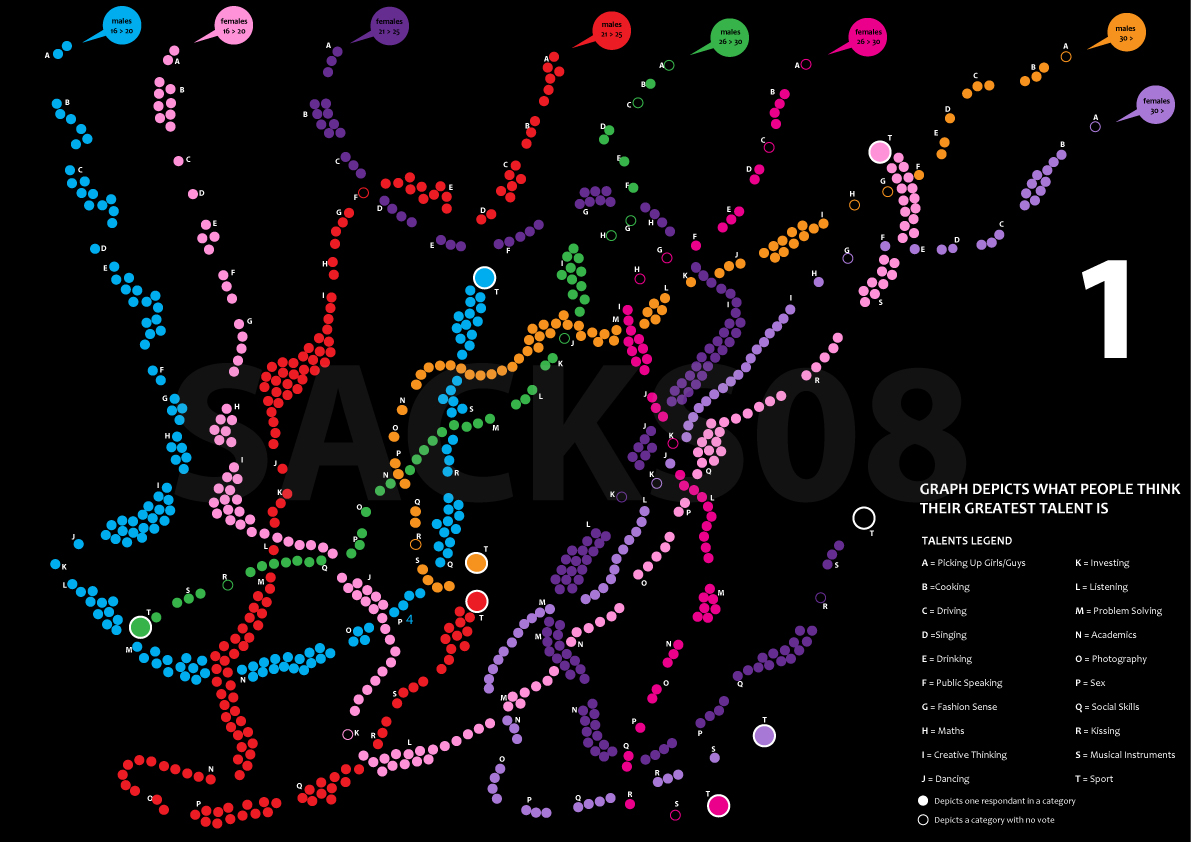
I read this article in FastCompany entitled ‘These Are The Weirdest Things Thousands of People Google Every Month”. When I got to the comments section, it became apparent that people are confused and lines are blurred when it comes to defining exactly what an infographic is. A lot of the comments lead me to ask myself “…so exactly what is an infographic?”
According to Google, an infographic is “a visual representation of information or data, eg. as a chart or diagram”. Every picture tells a story. Infographics should enhance cognition by presenting correlated data in compelling, easy to understand designs. They should tell a more complete story of data in an engaging way. One commenter put it succinctly when he said “..a well-designed infographic simplifies a complicated subject or turns an otherwise boring subject into a captivating experience”.
In today’s age of ‘fast-food’ media, ‘click-bait’ attention-grabbing headlines and general information overload, adding infographics to your website can be really effective as part of an overall digital marketing strategy. If you have data that needs to be communicated, an infographic is the way to go.
Just make sure it is visually engaging, on a subject that is interesting or relevant to your target audience, and is supported by other content across your website. Infographics are also among some of the most shared content on social media. According to this blog article via SlideShare, infographics are ‘liked’ and shared two times more than presentations, and three times more than documents on other social networks, such as LinkedIn, Twitter and Facebook.
Whilst the FastCompany article does include a visual representation of weird things people Google each month, it is essentially just an image with numbers. Its lack of constructive information and data means it cannot be classified as an infographic. Check out some infographics created by Ellis Jones.

