Transforming one of Australia’s most exciting lighting and furniture design studios with a new business strategy, brand narrative and visual identity.
Learn more about this project
Challenge
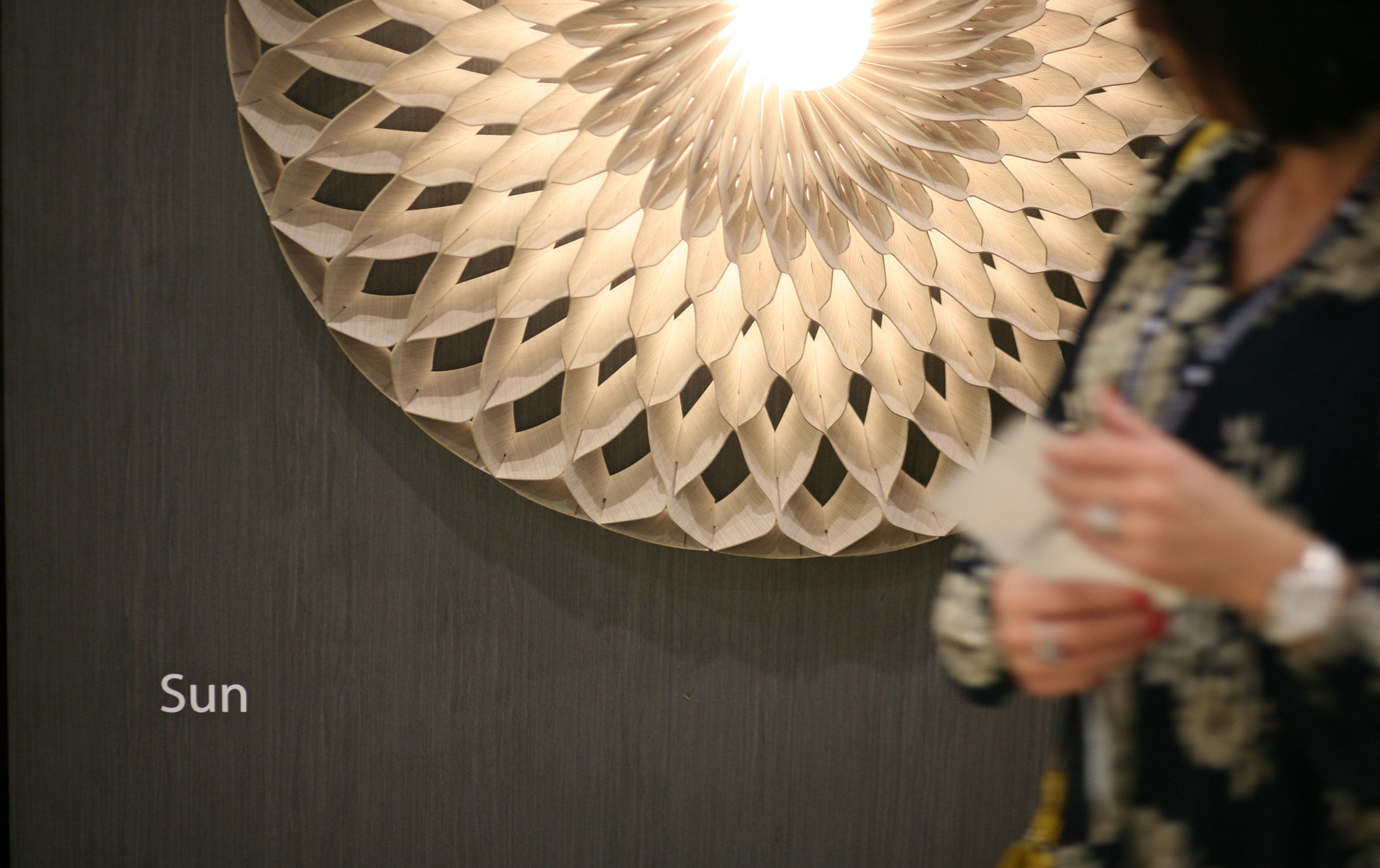
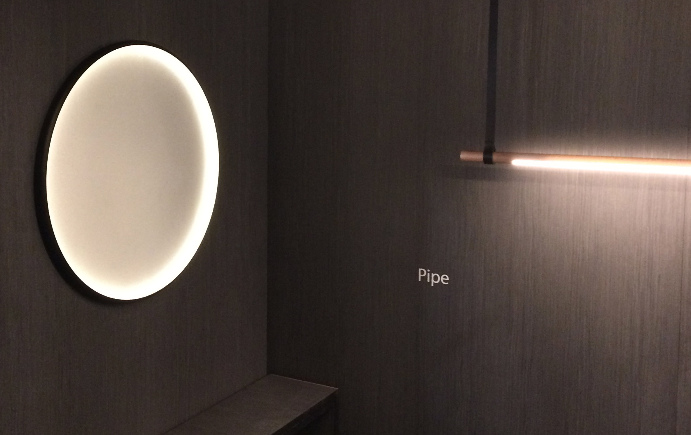
Copper design is led by two talented designers, Edward Linacre and Victor Legin, with multiple Australiana and global awards to their names, including the James Dyson award.
Although Copper had a portfolio of successful product designs and award-winning collaborations, in addition to the founders’ credible profiles in the design industry, the studio needed to crystallise its success and move to a new stage of growth.
With a lack of brand and value proposition differentiation in the market, Copper needed to find a way to clearly articulate their Australian difference in a global and increasingly homogenised design market.
Response
Ellis Jones worked closely with the studio to map the markets for its work: online retail, global design houses, interior designers and major developer commissions.
Using an efficient business canvas approach, the strategic advantages, value propositions, channels and networks were defined with strategies and tactics initiated to reorientate the studio. Importantly, the exercise helped focus the activity of the founders who, with limited time, had a deep desire to maintain creative output in balance with meeting the needs of a growing business.
To understand the identity of Copper as a creative partnership, Ellis Jones applied a tailored brand identity development process, connecting the vision and ambition of the company, the market needs and desires, and the organisation’s key competencies.
We conducted a branding workshop, which identified the key design characteristics that inform Copper’s creative output, imagined what a number of customer journeys with Copper would be and documented the characteristics of the company, if it were a person.
Copper was identified as being ‘astutely aware’. Through each interaction and transaction, the customer demonstrates that they are aware of what good design is (and isn’t), and the journey taken to create it. Buying a Copper product is a personal statement.
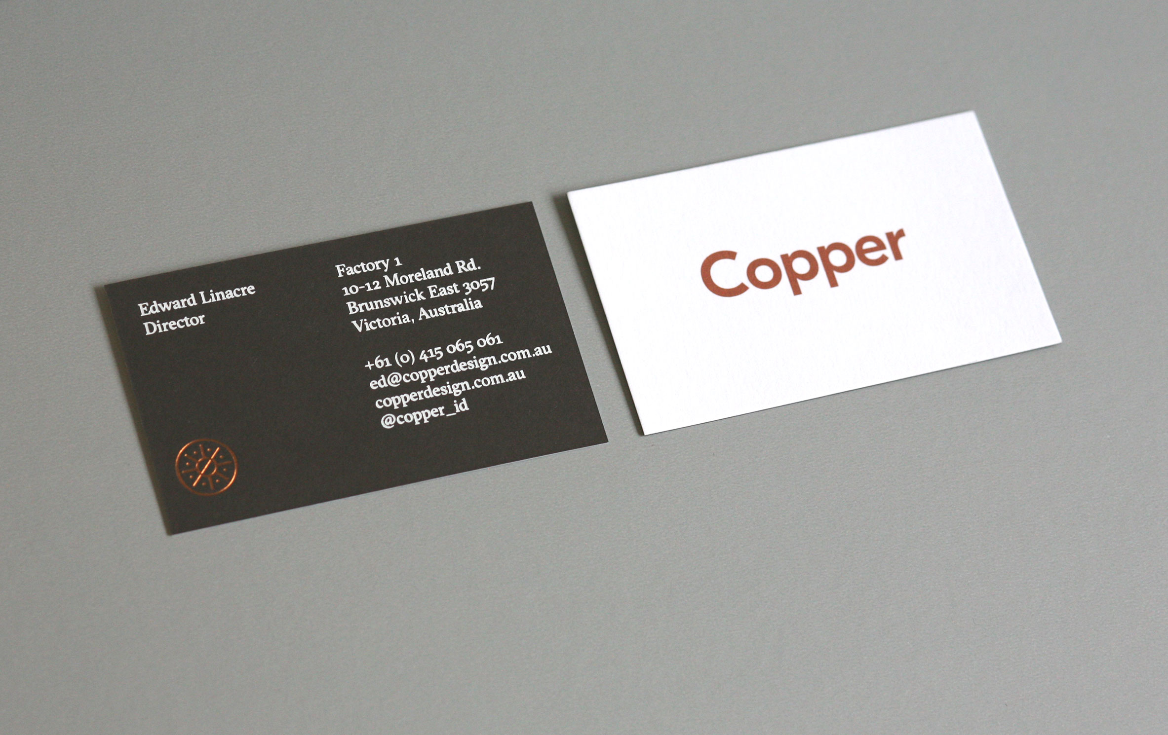
In defining who Copper was as a brand, a tone of voice and core conceptual identity, we began to develop the accompanying visual identity system.
Outcomes
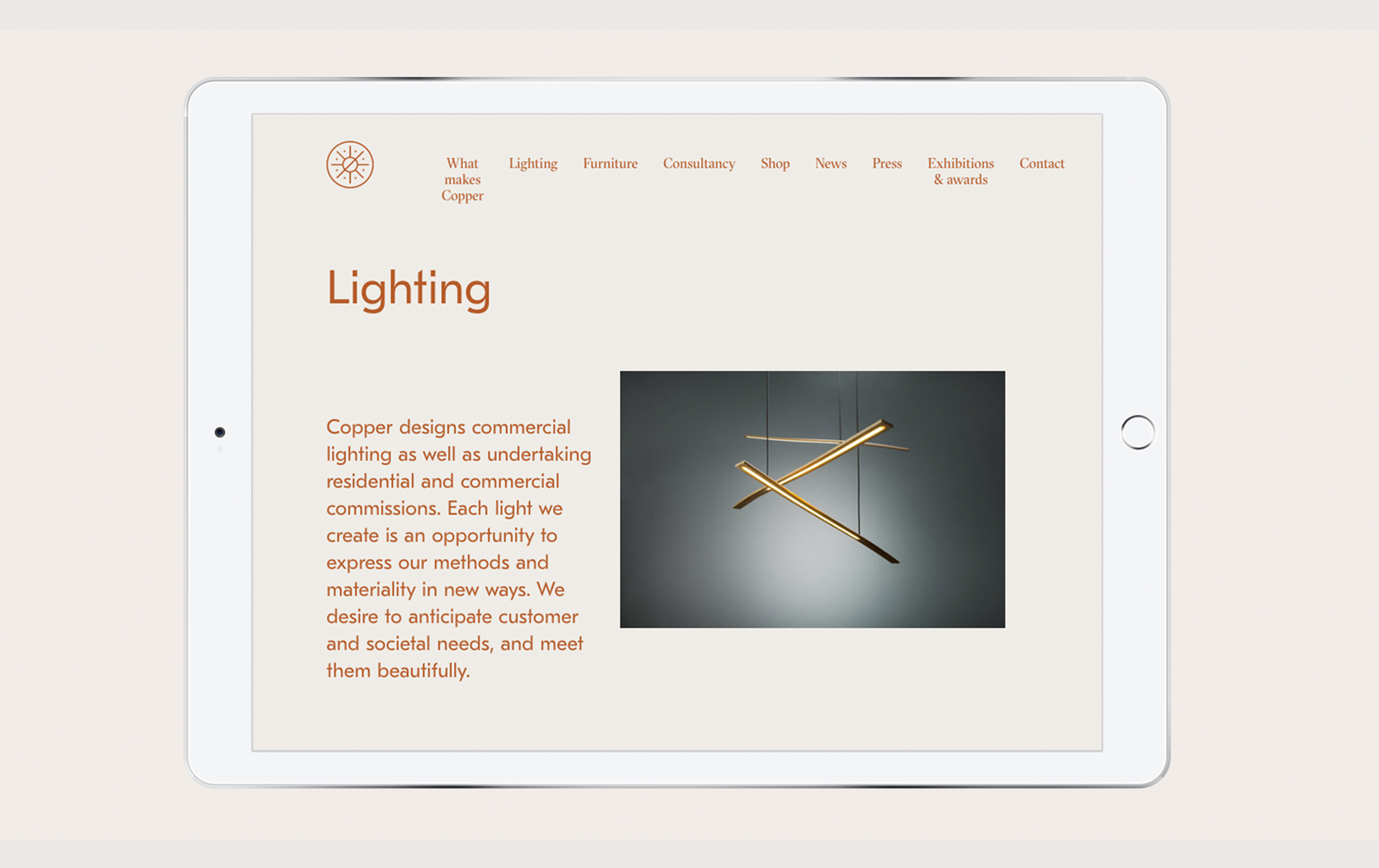
After establishing a visual identity for Copper, we applied the elements to a first draft of livery and promotional material for Salone di Mobile, as well as the Copper website.
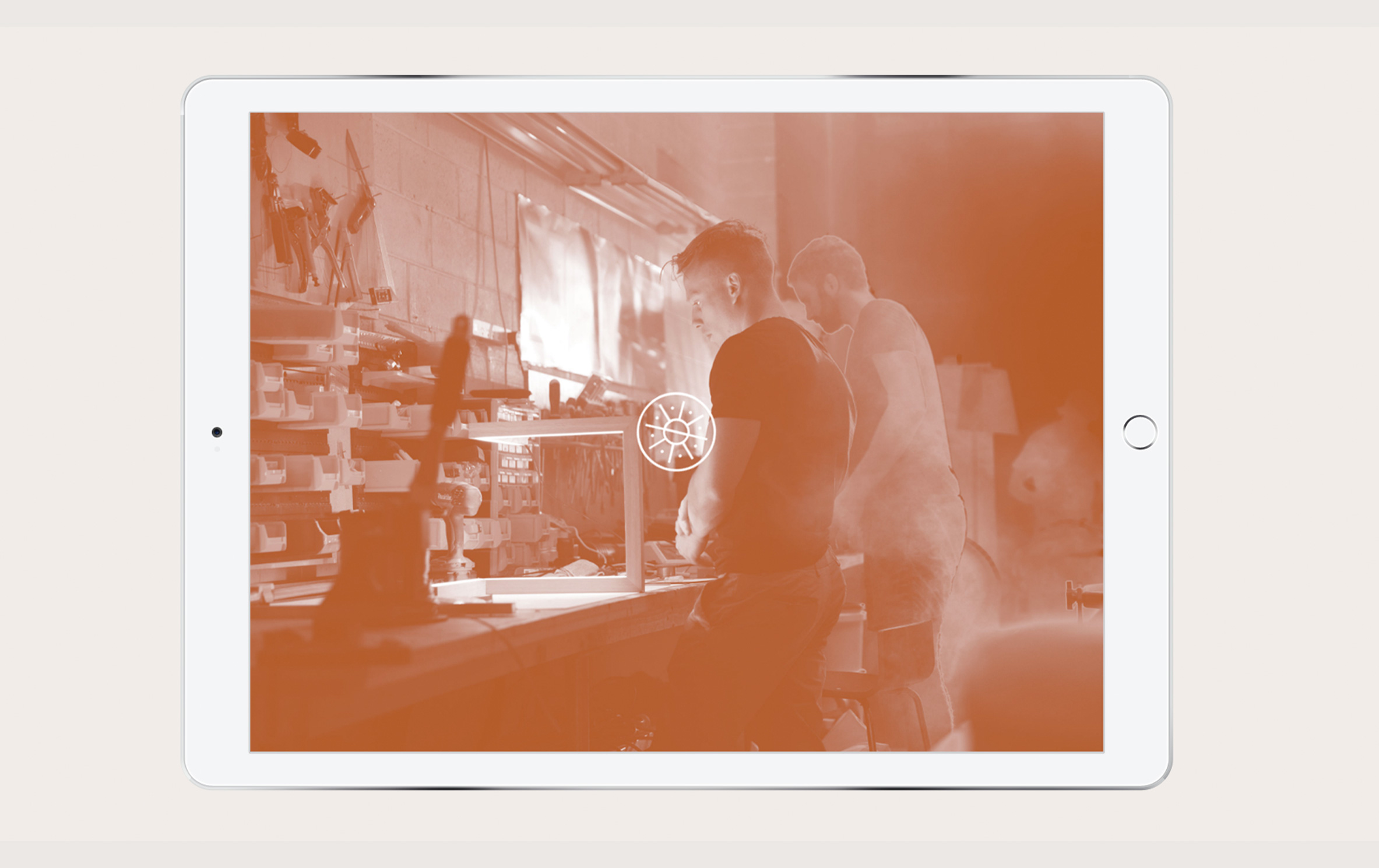
To transfer the visual identity narrative into the most customer central point was essential. Colours, typography, photography and the makers’ mark were utilised in the development of a new Copper website.
The homepage draws together work from across the spectrum of Copper’s output into one space for users to survey. Rollovers turn images from full colour to solarised copper. As users scroll, the menu changes to its minimised, sticky form. The makers’ mark is reintroduced as shorthand for the brand. Here finally, is a crafted digital showcase, fitting for the treasures with which it will be filled.
Copper’s work is rich in materials and stories, it has moments of breathtaking beauty, and we wanted to put that at the heart of all customer-facing elements.