Recently the EJ team has worked on three different infographic design projects that required visualisation of data and concepts to support understanding and accessibility:
- Victorian Legal Services Board and Commission (VLSB+C): Infographics to communicate the outcomes of research into lawyer health and wellbeing.
- Queensland Health: Visualisation of concepts relating to violence and aggression in healthcare settings.
- Public Libraries Victoria: Impact framework visualisation to communicate the impact of libraries on community health and wellbeing.
Before we look at the work, did you know that humans understand images way faster than text?
Humans are designed to respond to visualisation
Some studies suggest the brain processes visuals 60,000 times quicker than words. MIT research determined it takes as little as 13 milliseconds for images to be decoded?
This speed difference stems from our visual nature, as images are processed simultaneously and recognised via patterns, while text requires sequential decoding, making visuals more instantly comprehensible and memorable. We understand visuals faster because they affect us both cognitively and emotionally.
The human brain can also process many images simultaneously. With text, we can only process words one at a time, making it a slower and inefficient process.
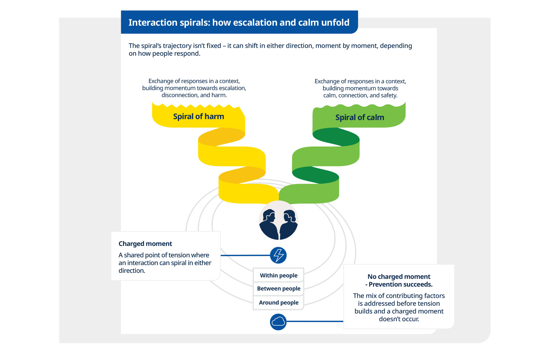
Carefully visualising violence and aggression
Based on recorded experiences of workplace violence and the number of serious workers’ compensation claims, SafeWork Australia reports that, beyond any other employee group, health workers face the greatest risks. One in six healthcare workers experience violence or aggression every year.
Violence is more likely to be perpetrated by a patient or person entering a health setting than a co-worker. This is because the behaviour of perpetrators is influenced by their illness or situation: they are frightened, unwell, under pressure, or simply overwhelmed.
As the visualisation above defines, how the health worker, the team behind them, and the system prepares for, and responds to, violence and aggression make a huge difference to the outcome. Things can spiral up out of control or move to a place of calm.
The expert team at Queensland Health chose to include infographic design within their Framework for Preventing and managing violence and aggression, cognisant of the complexity and sensitivity of the information being shared. The framework is currently out for consultation.
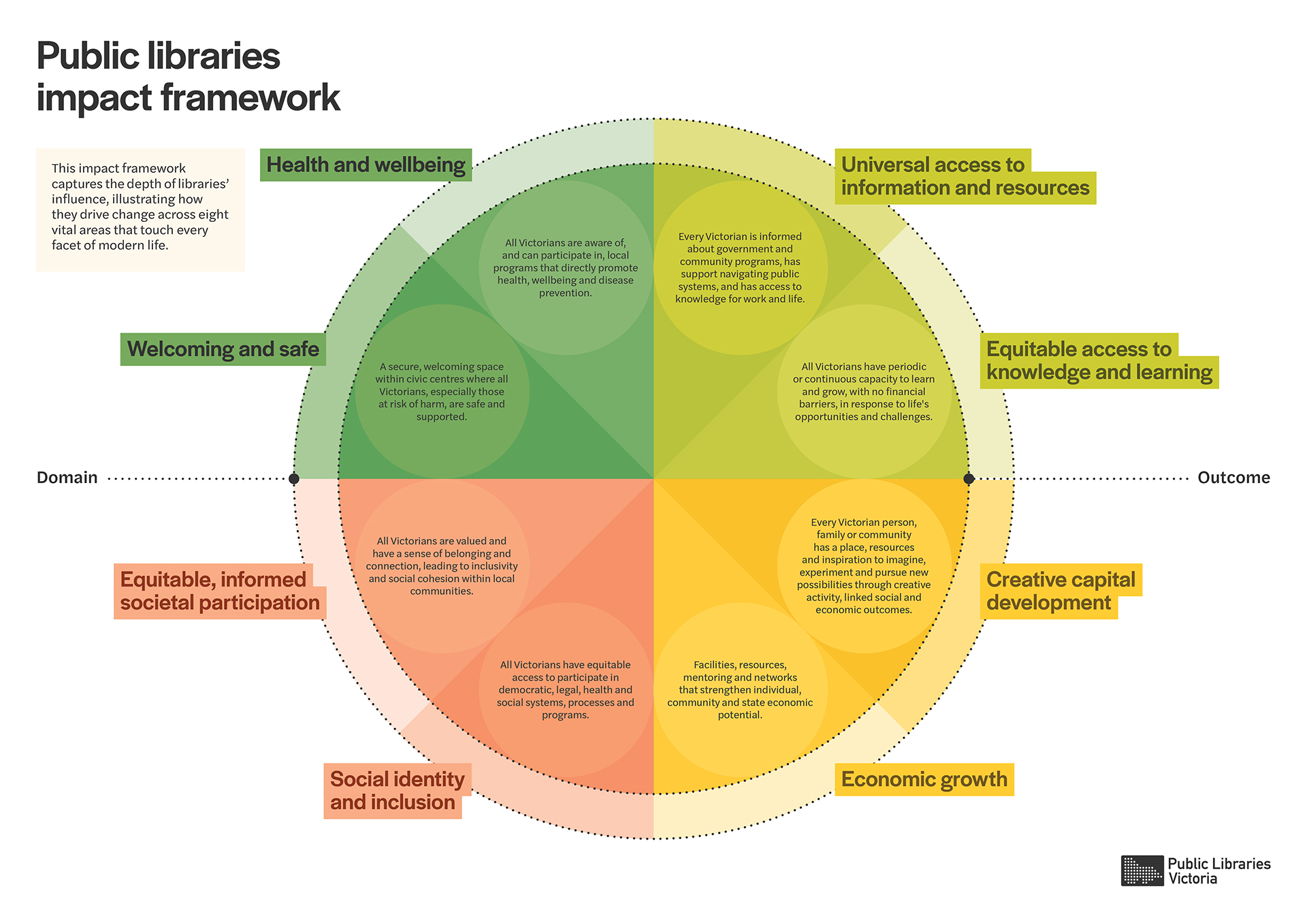
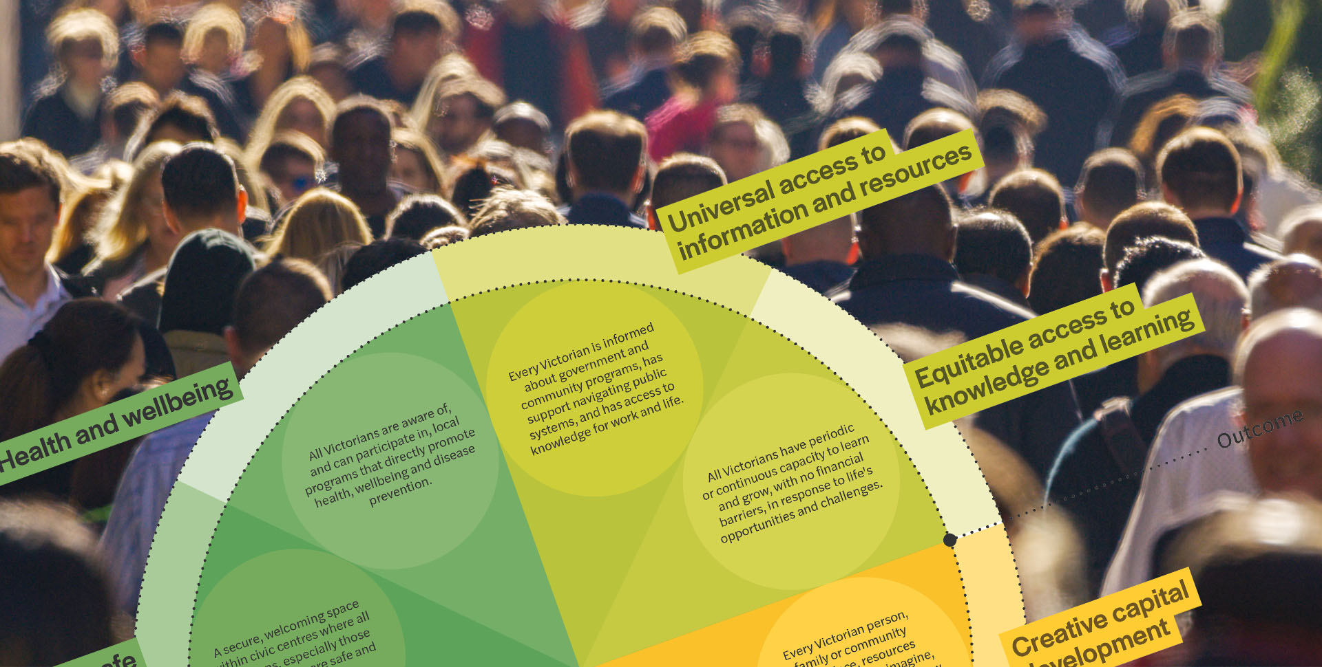
Picturing the diverse impacts of public libraries
More than 1.15 million people – or one in every six Victorians – visit public libraries, in person, each year.
Libraries are settings for vitally important – yet largely unrecognised or evaluated – social, health, employment, legal, political and education activities that strengthen and change lives in all Victoria’s diverse communities. Yes, you can read a book, but for new migrants, small business owners or people escaping domestic violence, for example, libraries are much, much more.
With increasing pressure to support communities with unfunded services, Public Libraries Victoria wanted to establish the contemporary impact of libraries as community hubs addressing health and wellbeing.
Our team developed a report (currently sitting on the Minister’s desk) that comprised research data, insights, and visually rich case studies of people in libraries across the state. We also developed an impact framework to articulate the different benefits of libraries in one infographic design. See image above or download a PDF. Libraries really do make a difference!
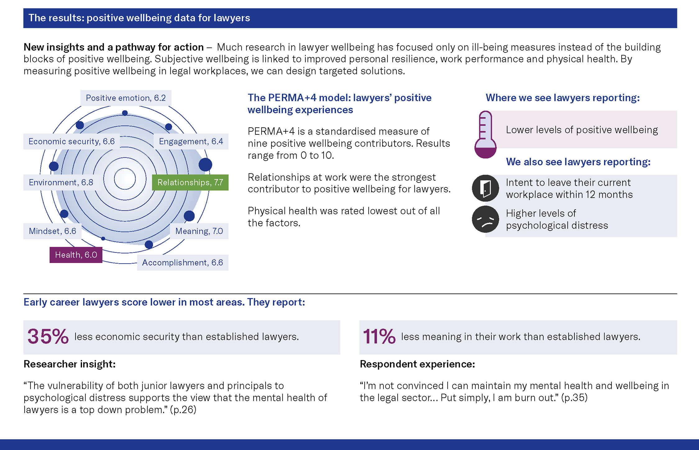
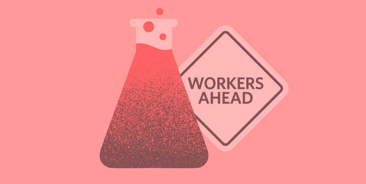
Infographic design to explain lawyer health and wellbeing
The VLSB+C are responsible for the regulation of the legal profession in Victoria. Their mission: maintain and enhance public trust and confidence in the legal profession in Victoria.
Upon releasing a landmark report, Lawyer Wellbeing, Workplace Experiences and Ethics, the wellbeing team wanted to explain the impact of health and wellbeing on the legal profession, and how to improve it.
It’s no secret that wellbeing is a serious issue for the legal sector and manifests in many ways – particularly burnout and distress but also conduct. The VLSB+C found over 50% suffer burnout, 30% show symptoms of depression or anxiety, and 50% have high psychological distress.
When over half the target audience has reported cognitive overload, reaching them with paragraphs of text or cascading bullet points is highly unlikely to gain attention or change behaviour. That’s why the VLSB+C team chose to use infographics which can be easily displayed in workplaces and repurposed for digital communication.
Take a look at three of the infographic posters: