Make it clear, make it accessible. This was the challenge we set ourselves when designing the visual system for the Energy Info Hub and associated materials.
All well-conceived visual systems are exactly that: systematic. They use design elements such as colour, shape, form and space to make compositions that are resolved in aesthetic and meaning.
In this way, we drive brand recognition, sell ideas (products or services), and help create positive and coherent user experiences.
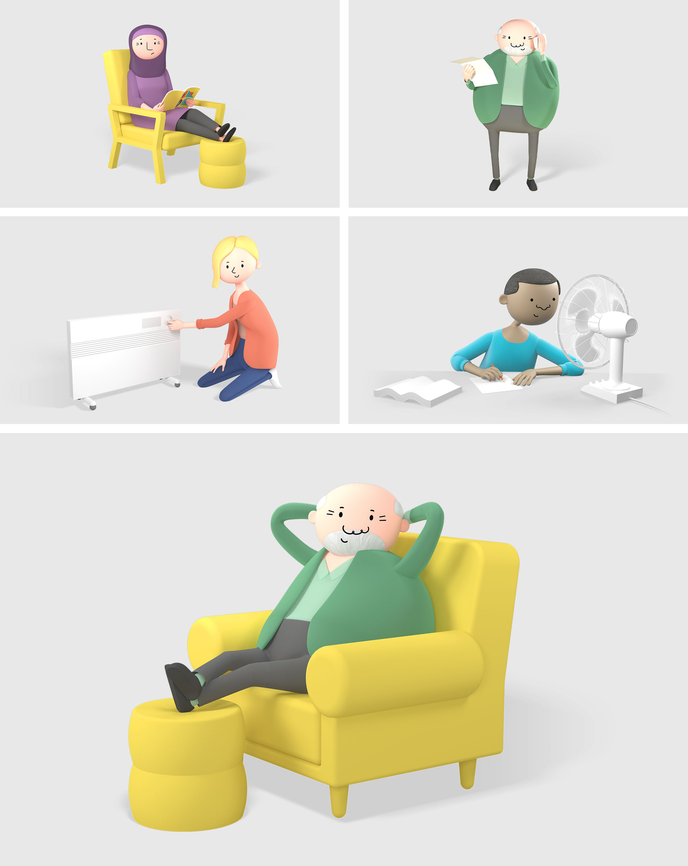
Ellis Jones was engaged in partnership with the Consumer Policy Research Centre (CPRC) to develop a suite of training materials for community workers to become more energy literate and better support their clients. Delivering accessible energy information and tools required specific consideration of those who may be experiencing energy poverty. These included: low socioeconomic groups, culturally diverse groups, single-income households, elderly people, students living independently as well as people with chronic health needs.
The audience diversity, and layered information and need to be understood, drove our guiding project principle. That of ‘radical accessibility’. We asked, “what if we let formal accessibility requirements lead the aesthetic?” Curating, rather than creating, design elements into a ‘multimodal’ system encoding information through colour, form, and written language. Despite varied literacy or cultural context, multiple visual cues meant anyone could understand the content structure through a mechanism meaningful to them. Ultimately providing a vehicle for users to become more energy-literate.
Colour
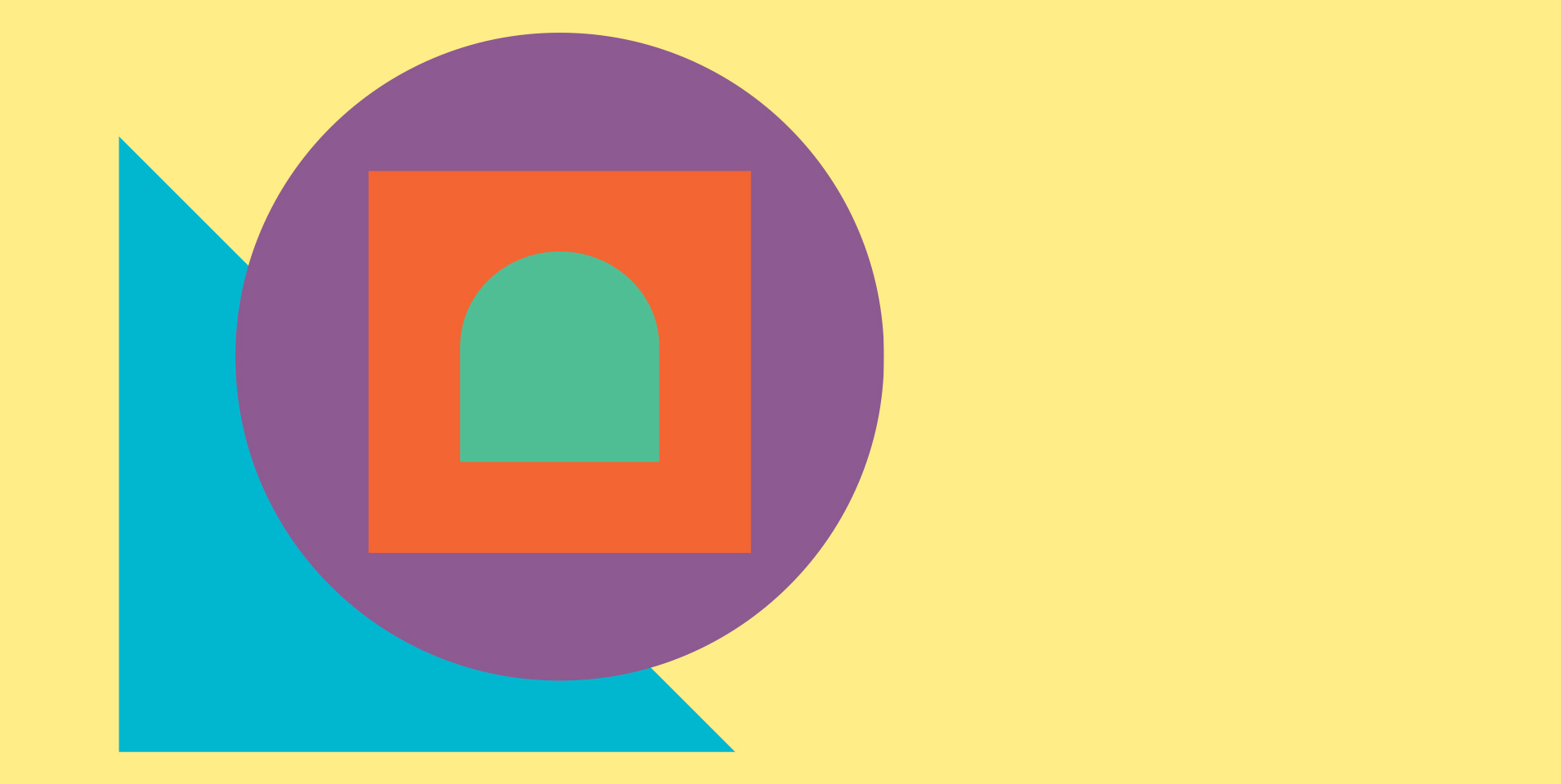
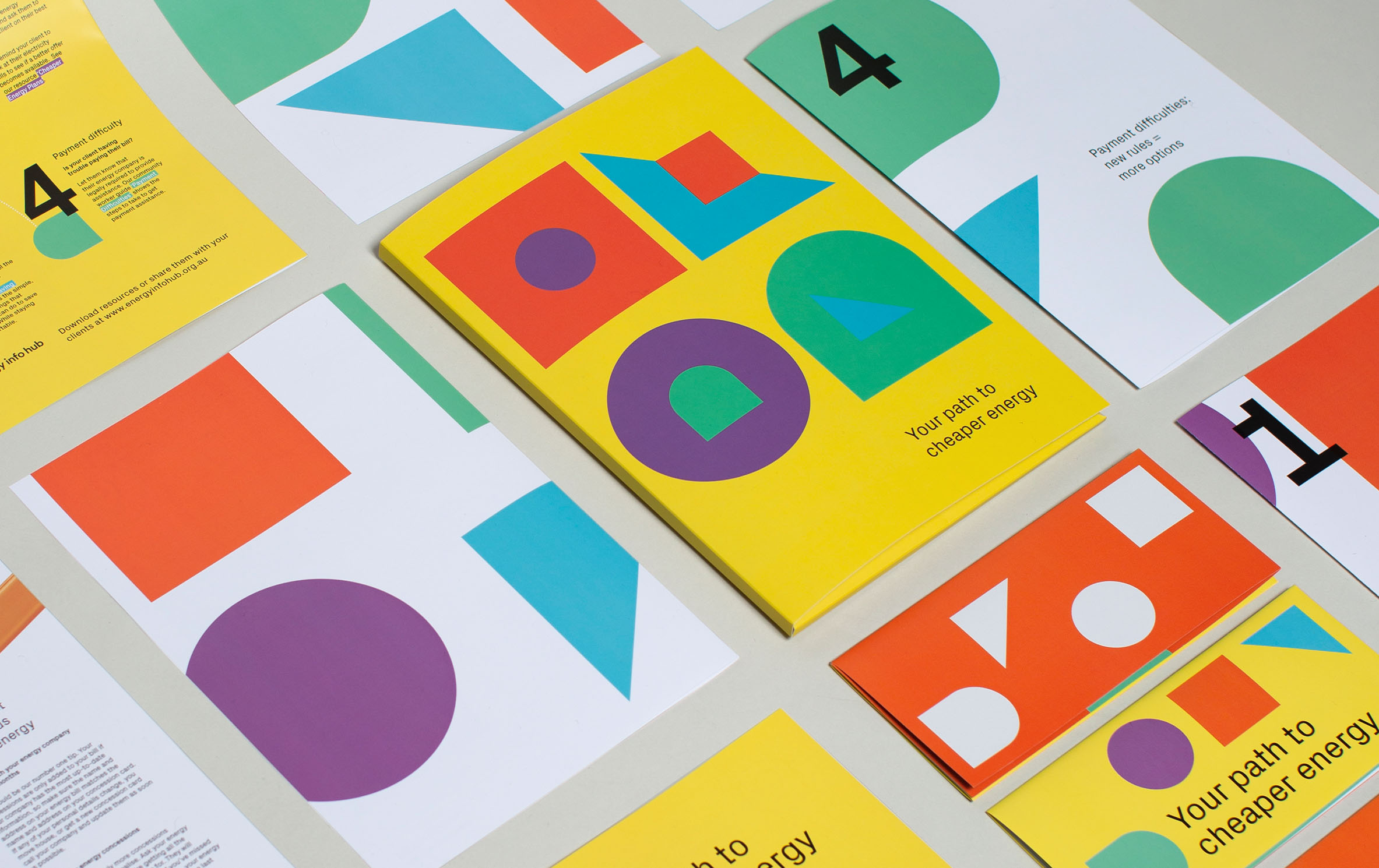
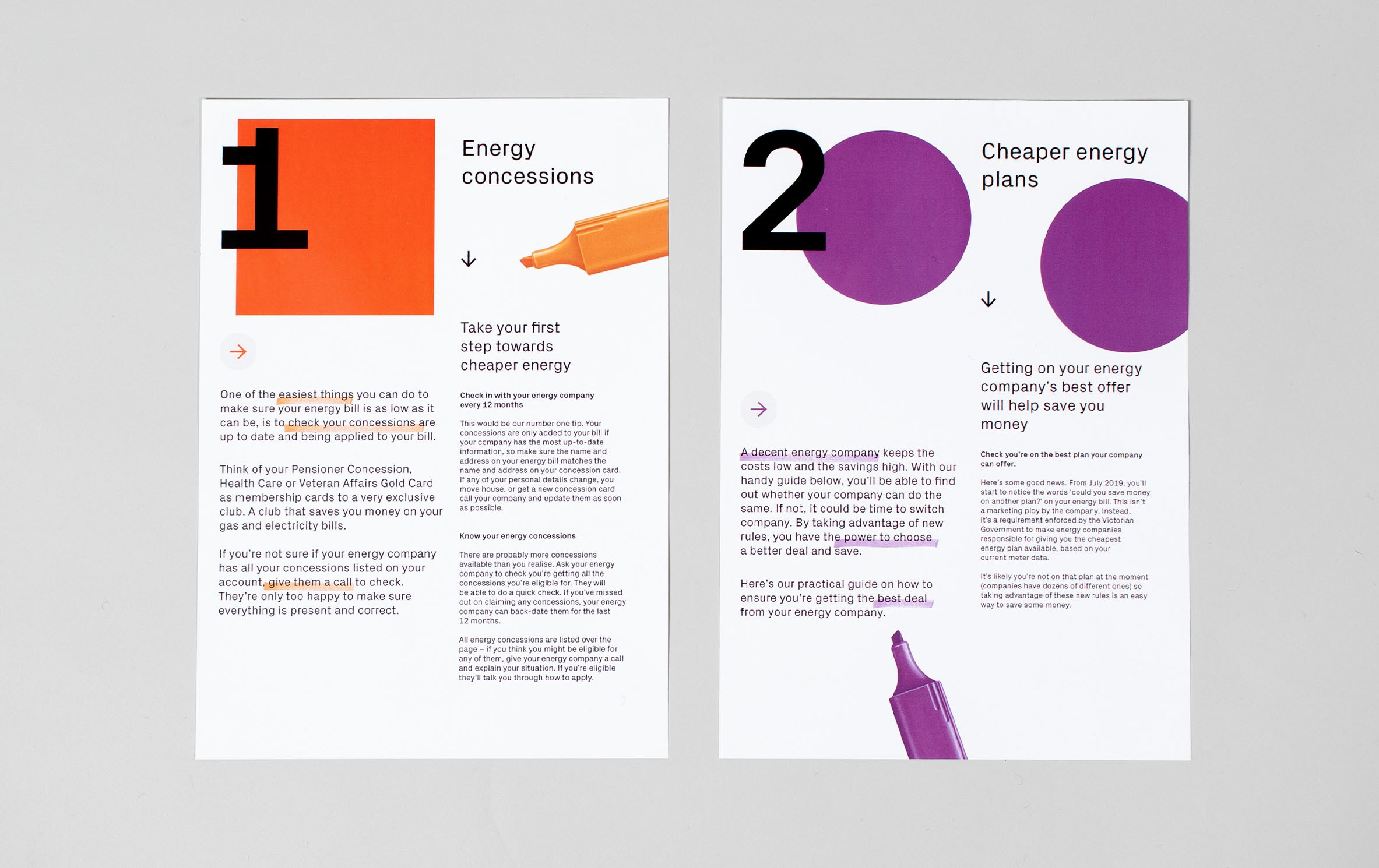
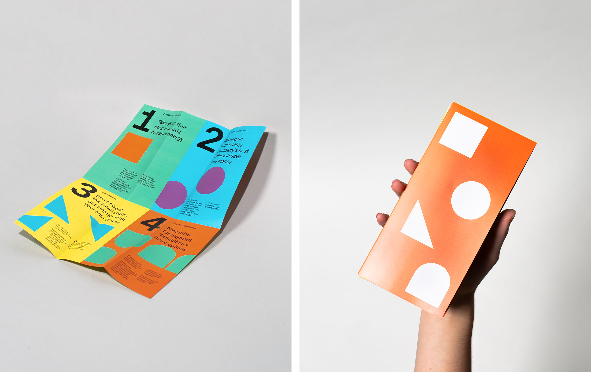
- 4 bold, solid, and bright colours were employed to easily identify each of the key topic areas.
- Colour was used to represent a hierarchy in the breadth of materials created: intensity of colour identified the different levels in the information system; from bright, bold pamphlets providing an overview of key information, to factsheets with more white space and coloured highlights housing more detailed information about a single topic.
- The colours, while all bright, were designed to be recognised as representative of a key topic, while having enough contrast to be legible when paired with text.
Shape
- 4 shapes were employed to identify key topic areas – easily recognisable geometric shapes used at scale help to denote each content theme.
- Harnessing the positive associations of simplicity without being childish, the use of geometric shapes assisted in creating aesthetic rigour and harmony.
- Shapes also provided a literal navigational tool in the digital space, creating an element of play for an otherwise serious topic, while creating recognition with the printed materials.
Typography
- Numbers at large scale indicated the steps to take to negotiate through the broad range of information materials, to allow community workers and their clients alike to understand a suggested order to regaining control over their energy bills.
- The use of formal, but slightly ornamental typography, allowed the resources to live outside the potential negative experiences readers had had with government, while ensuring accessibility through written cues.
Illustration
- Character animation allowed us to personify the key circumstances, behaviours and other information sought by our audiences, teaching by showing rather than telling.
- Character design was representative of the cultural and linguistic diversity of the target audience.
- Time and sequence allowed the static geometric navigational elements and colour theming to come to life in three dimensional, context-specific environments.
This project proves it is possible to bridge diverse accessibility requirements, complex information hierarchies, and compelling visual design without compromise. This is the design process at work: synthesising content and context, applying a lateral creative lens, and executing though a mix of traditional and emergent formats and channels. Truly a win-win-win!
Our work on the Energy Info Hub was shortlisted for the Design for Good category at the AGDA Awards 2019. For more information on this project, its objectives and outcomes, read the case study here.
Talk to us and explore how design can create impact in your world.