Reports – be they research, project, annual or otherwise – are rarely the darling of the communications calendar, or at the heart of the brand bible, often spoken of with ‘colourful’ adjectives, and no small amount of contempt. Report writing and design that tiresome job to be done.
It doesn’t have to be this way! Reports can be brand champions: rich in personality and narrative; a brimming tangible expression of your organisation’s impact.
This article considers report design for different objectives, people and places. It assembles some of the fruits of our collective experience. We’ve looked again at the collection of trends and opportunities shared back in 2018, and sharpened them with the benefit of more adventures and experience hence. The relevance hasn’t diminished!
We’ve also considered the opportunity of the report as a format of brand activation. Once ‘second string’ brand applications; reports, pitches and presentations have taken over from brochures, business cards, letterheads and stationery as the workhorse vehicles of brand expression for the digitally distributed age.
Easily overlooked, a long form document like a report can present a chance to tease out personality and tone, surprise and delight, model efficiency, clarity and quality, and most importantly, inexorably link purpose to process.
The EJ Design Studio has logged a fair share of hours on reports over the years, from community organisations to industry peak bodies, state and federal government departments and agencies. Too often, organisations miss this rare opportunity to engage a multi-stakeholder audience with a story beyond compliance or evaluation. You can bring to life the practical impact made on the lives of your customers, clients, collaborators, and partners by design.
Regardless of scale and budget, there are ways to make your report stand head and shoulders above the pack, to engage, inspire and be memorable.
Wow data
When it comes to data, big is beautiful. Report design should draw in the reader, and facilitate their access and understanding of data. There is beauty in visualising big data sets with nuance and respect for their integrity.
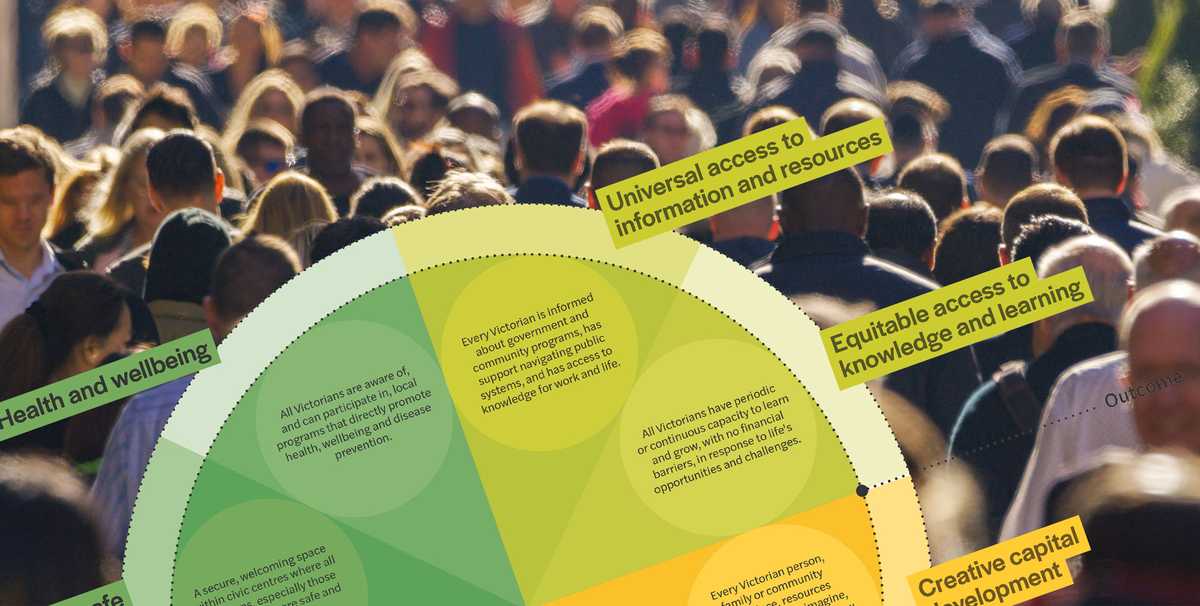
Intricacy can attract and validate the written narrative. Metaphor or visual puns can inject humour and encourage accessibility of complex numbers. Colour and form can accommodate higher context messages whilst also introducing a hierarchy to data reporting. There is no excuse for banal bar graphs any longer!
See our work for the Greening the Greyfields’ project playbooks, elevating the output of community code designed tools.
Colour riot
Colour and emotion are old bedfellows. Colour will impact a reader subconsciously before any conscious processing of content occurs. Use it wisely, use it wildly!
Colour can be subjective, but for practical purposes, it can also be objective. Some colours carry global symbolic associations; others local, and some, personal. The weaving of these threads is where the magic occurs.
See our work for the Architects Registration Board of Victoria, and how we used colour and material to lift a report beyond the mandated frugality of government reporting guidelines.
Telling tales
Report design is an opportunity to embed your purpose and brand story. It needn’t be a technocracy, populated by sterile objectives, outcomes and ROI data. Tell your reader a story, enhanced by visuals and materials. Illustration, photography, and formats that entice and engage set a document apart.
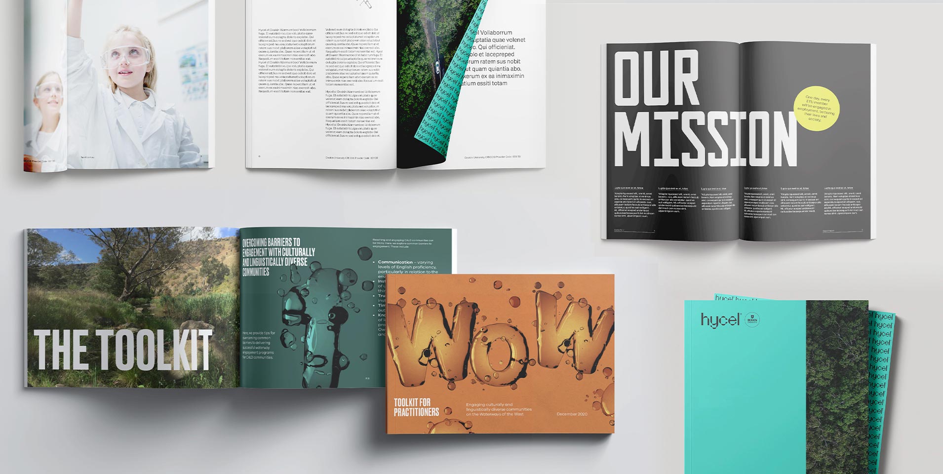
See our work creating the Deakin Hycel brand, working the narrative and purpose of the organisation into document design.
Zero trees
A digital annual report broadens the horizons no end. Interactivity, video, animation, and real time visualisation allow users to construct an experience in tailored and non-linear ways. Key information can be delivered at different levels of depth and complexity dependent on audience need, and content can be literally and directly connected to external sources, entities and models. In situations where a physical report is still a statutory reporting requirement, a digital companion may allow the print version to be lighter in content, resources and footprint.
See our work for the Australian Renewable Energy Agency (ARENA), creating a cohesive online and offline report experience.
The ‘distributed’ cheerleader
Through the COVID shift to distributed working, the physical manifestations of brand (many already dwindling in a world of digital first relationships), have been sidelined. How many business cards have you collected since 2019, how many printed proposals, pitches, portfolios have your received – let alone presented in person? More likely, your experience has been that of relationships begun with a Zoom call, and an impression shaped by a ‘share screen’ PowerPoint.
It is in this environment that previously overlooked digital assets, such as report templates, model and concept diagrams, or the ubiquitous ‘1-pager’ now bear the dual responsibility to connoting your organisational identity. To simply remit on a functional requirement is no longer enough. They must excite, entice and evoke an experience of brand.
Much of our brand work focuses on elevating organisational purpose and impact, from which to define personality, relationship and relevance to key audiences. Distilling the difference, and using it to maximum competitive return.
Often reports are relegated to artefacts of project output, and lack consideration for telling the ‘bigger story’. Framing the ‘why’ of the work, before sharing the ‘what’ turns functional requirements into brand ambassadors, and proof points for purpose.
See our work on the Yüme brand, and bringing personality and visual impact to reporting and presentation.
The time is now
It pays to put design in the mix early. Considerations around format, production, photography, illustrations and other commissioned content can help shape project design, often creating efficiencies in execution and budget.
Annual reports will soon be in full swing. Let’s make sure your report is one that is talked about for years to come.

