Uniting digital and physical experiences at Australia’s largest multi-arts precinct.
Learn more about this project
Recognition


Challenge
Abbotsford Convent is an amazing place. Four kilometres from Melbourne’s CBD and spread over 16 acres, it is Australia’s largest multi-arts precinct.
The former Convent of the Good Shepherd, it was snatched from the jaws of destructive development by highly organised, persistent community activists. Now, it is owned and operated by the Abbotsford Convent Foundation (ACF), on behalf of the public.
For Ellis Jones, this was a rare brief – to search the soul of a place and bring it to life in the digital domain, while also evolving the brand identity. For a short period (relatively speaking) we have been custodians of heritage and participants in the convent’s unique and authentic culture.
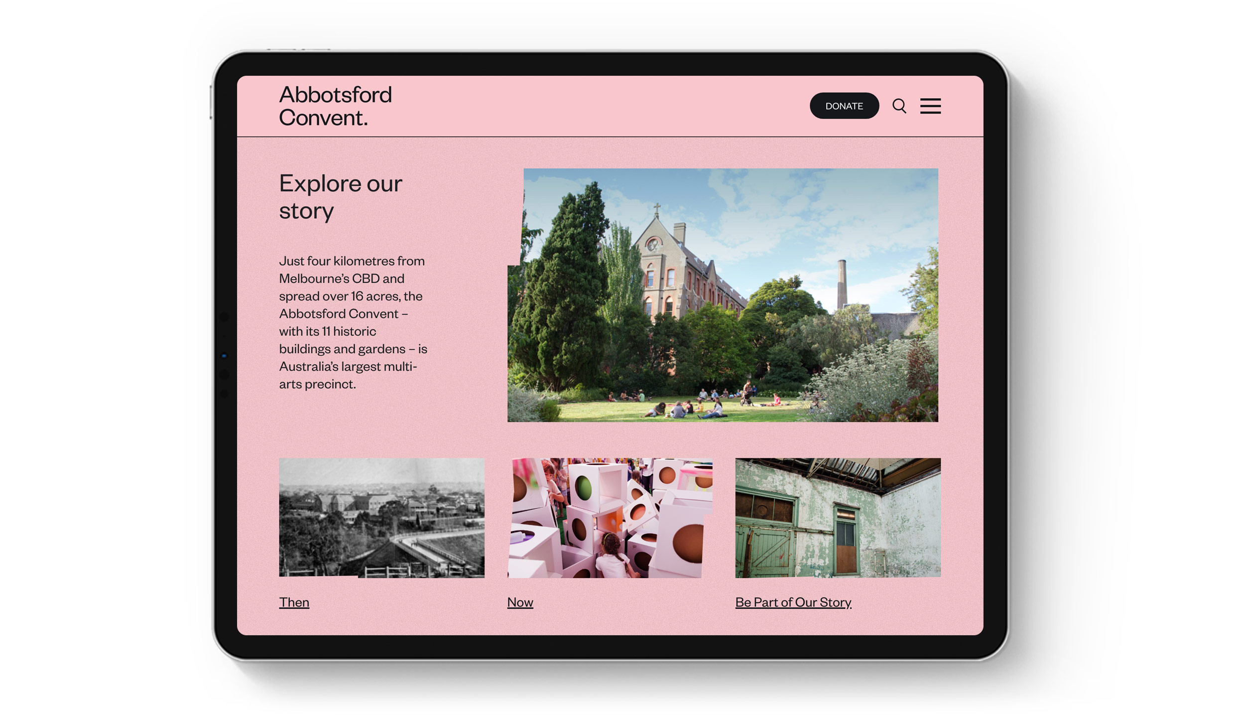
Changes to digital infrastructure presented an opportunity for the Abbotsford Convent Foundation (ACF) to strategically evolve its digital presence, to better meet tenant, visitor and organisational needs. That experience centres on the Abbotsford Convent website.
The creative partnership with Ellis Jones began by aligning the project with broader ACF strategic priorities:
- Bring the ‘Convent-as-platform’ to the fore for tenants, collaborators, partners and visitors alike
- Cultivate and express an authentic sense of place through the digital experience.
- Surface organisational purpose, values and impact.
- Ensure visibility of programming as paramount.
- Facilitate (and measure) rental bookings, ticket sales, new tenancies, visitor attendance and donations.
- Ensure a ‘back-end’ user experience that champions efficiency.
Response
Drawing on the agency’s diverse experience working in place branding for arts companies, cultural institutions, property developers and impact investors, we undertook comprehensive investigation.
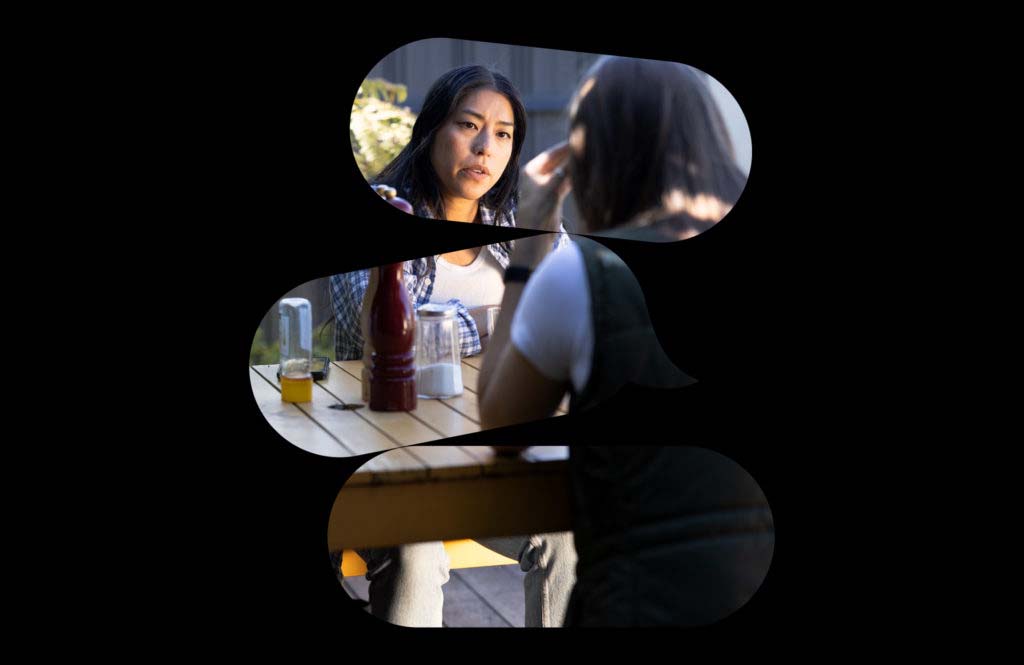
- In-depth qualitative research, in the form of stakeholder surveys and interviews, defining key user personas.
- A thorough audit of the existing site, combined with research into comparative and analogous precincts in Victoria, Australia and across the globe.
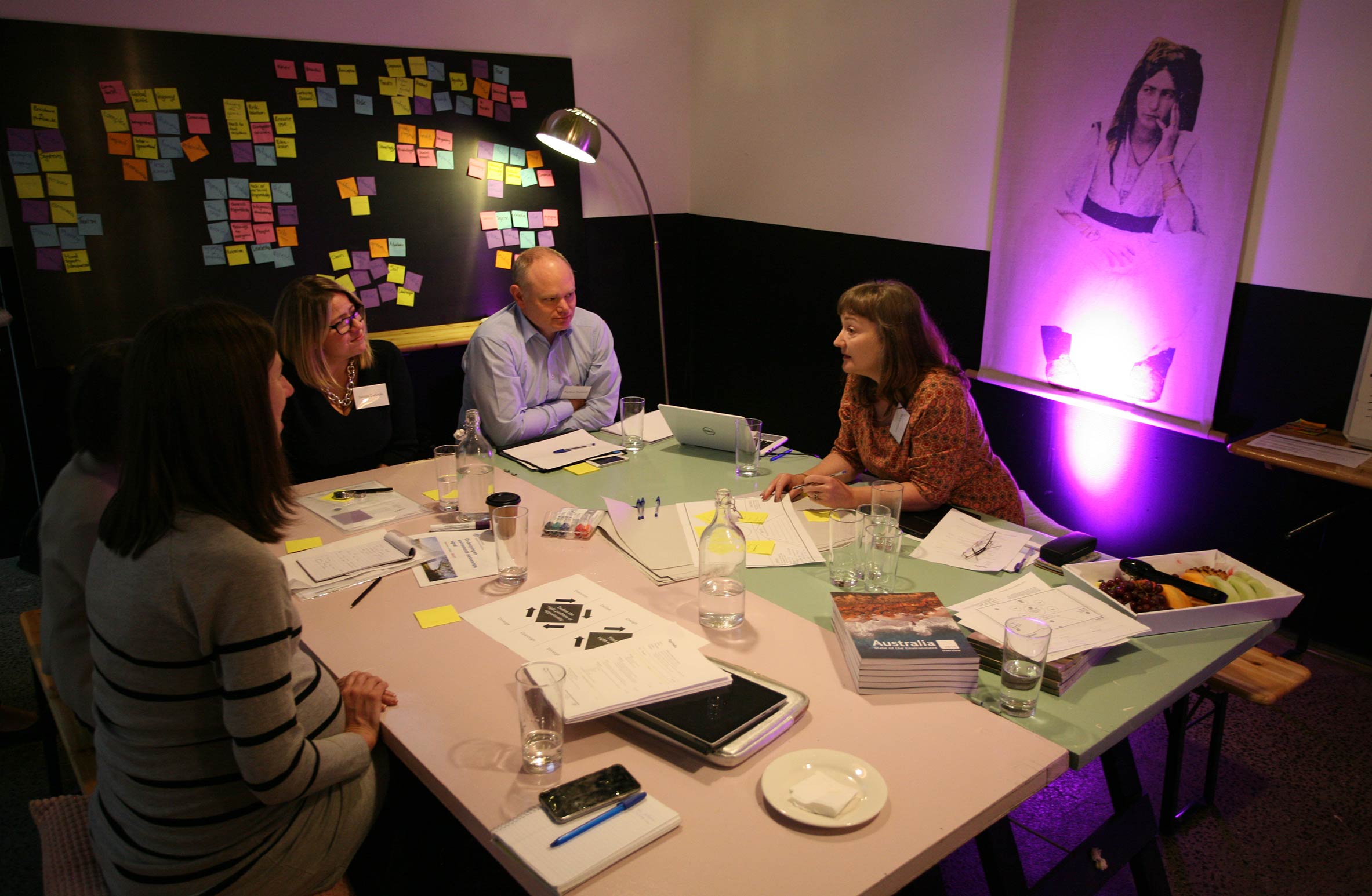
- Co-design workshops with the ACF project team produced functional requirements, revised content architecture, and desired user behaviour and experience. All enriched by insights from stakeholder research.
From this work, insights were drawn and applied:
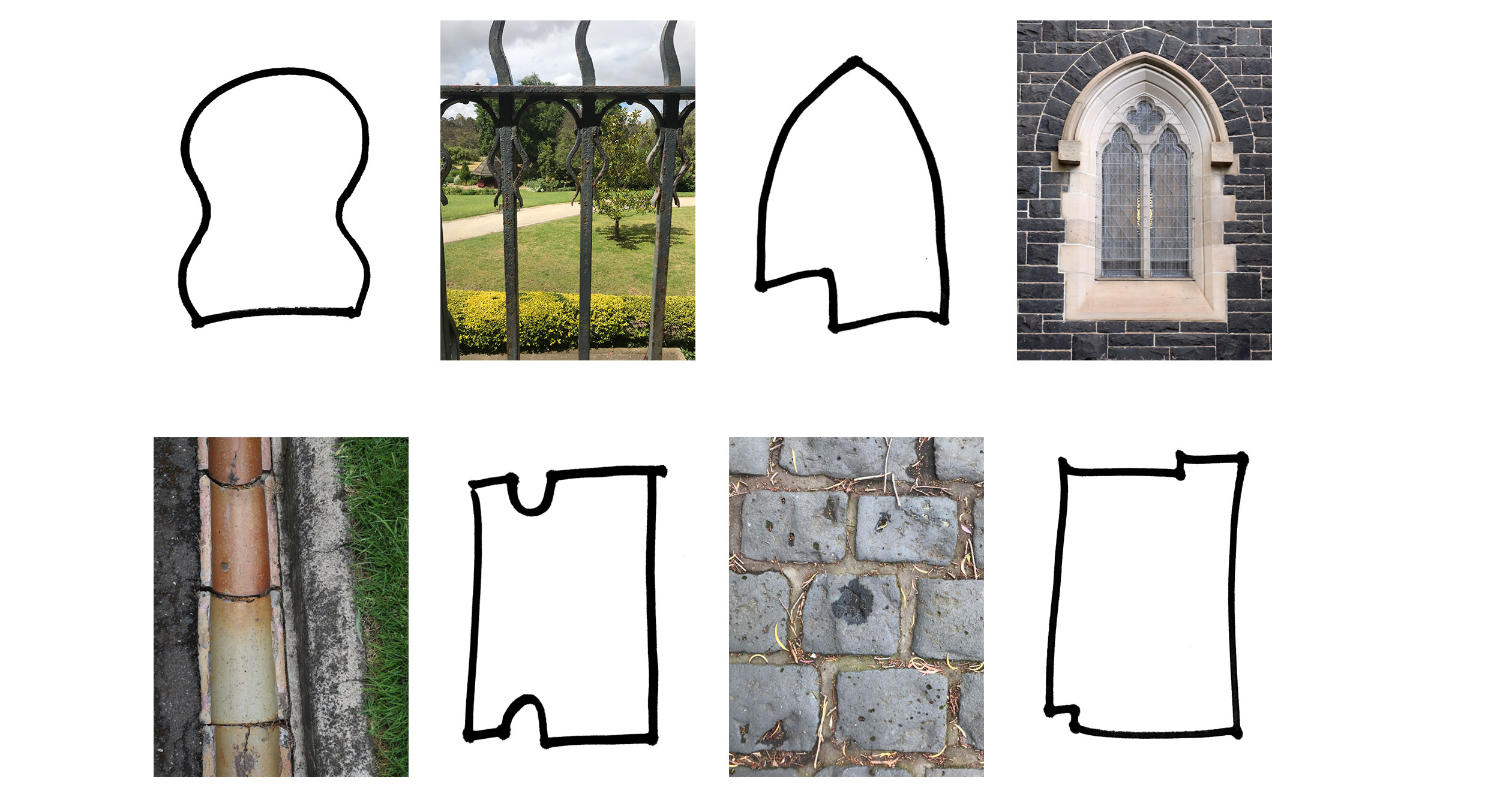
- Multiple site visits documented the unique features of topography, aspect, architecture and function through photography and illustration. These elements were distilled and define the core visual language of the entire site.
- Overarching UX principles created a frame to assess proposed revisions to architecture, base functionality and user interface (UI) design.
- A philosophical concept of ‘everything leaves a trace’ evoked the history, character and cultural depth of the Convent as a place of many lived experiences. Diverse in population and purpose for thousands of years, the precinct experience is layered and rich.
- Ellis Jones’ creative response to user experience and interface was driven by guiding principles. Stating that the new site must be:
— a contemporary interpretation of place;
— not pastiche or facsimile;
— willing to ‘break’ the perfect;
— inclusive, not exclusive; and
— brave, rich, alive (linking URL & IRL).
Outcomes
The new Abbotsford Convent website heroes the visitor experience that makes the precinct so alive in the physical world. An experience that is at once rooted in architecture but serendipitous in cultural exchange.
Working with developers, Bone Digital, we were able to collaboratively push technical constraints, achieve a level of detail and depth of contact – you reach into this website. It lives and breathes.
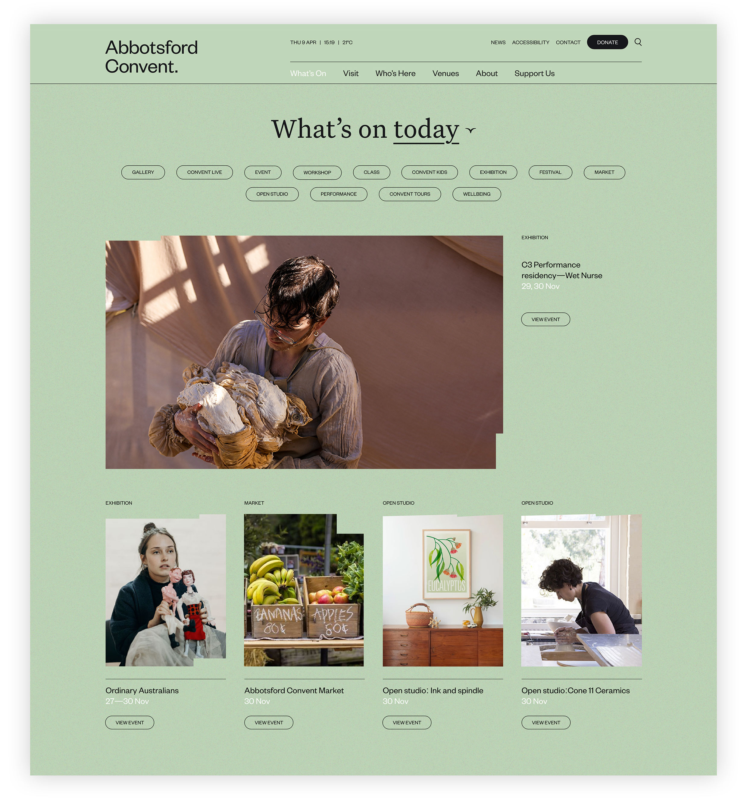
The design supports the transmission clear functional information and delights with a curated showcase of the events, tenants and experiences on offer. Users can search and filter content by days, weeks or months, dependent on their interest and needs. The site presents content tailored to a user’s interests and intent.
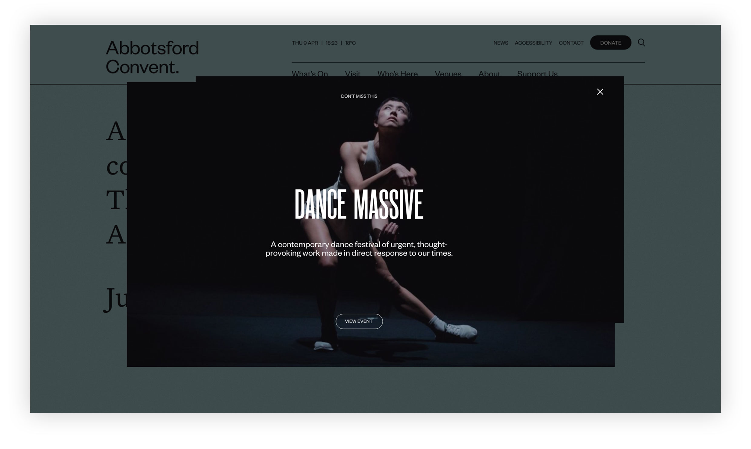
The colour story of the site – played out in the background – shifts throughout the day and night, with hues drawn from the convent surrounds. A vibrant ‘story tracer’ (tracking the cursor) follows the user around the homepage – a visual clue that they too ‘leave a trace’ on this place, even in the digital realm. The user becomes part of the story.
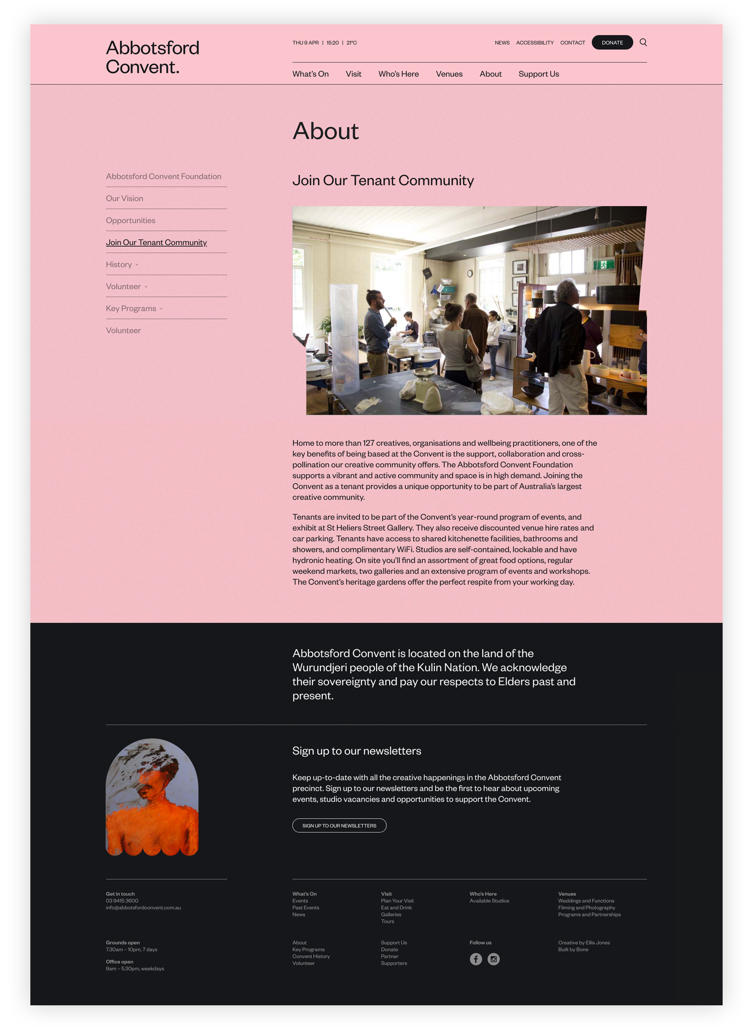
Further merging experience, images are housed in frames whose shapes are derived from the layered architecture of the Convent buildings: windows, archways and gables.
Programming and tenants are lifted to greater prominence, the history of the precinct is acknowledged and respected, and the present and future purpose expressed clearly.
Furthermore, the function of fundraising and donation has been refined and more strategically integrated into the user experience – a necessary improvement for a not-for-profit reliant on philanthropy to keep those experiences evolving for another 100 years. This century in digital and physical dimensions!
